Pages

Wednesday, December 12, 2012

Sharing a few things...

Hello Everyone!!!!

I've got a few cards to share with you that I've made recently for the Paper Wings Productions blog.  Click on the title link to see more details on these cards.


Classic Christmas featuring Old St. Nick


One Layer Cards:

Krafty Christmas


Christmas Collage


Winter Peace


I'm enjoying looking at lots of Christmas card inspiration and working at my newly cleaned table - imagine that - I can find what I'm looking for :)


Before I go...

I've missed the chance to comment on all of the cool "dates" this year, but it dawned on me that this one is my last chance of the year! 

Today is December 12, 2012.
 
12/12/12

I just think that's fun! Yes, I'm kinda nerdy like that!  Proud of it too!!   If I was still teaching math, I would probably have had a lesson all about that.  :)

Has today been a "cool day" for you??  I know the temps were cool here, and I also think it is pretty cool when things that you are working on start moving in forward motion.  Here's to an exciting winter and new things to come!  Hopefully in a few days I'll be reviewing some digital things I've been working on and preparing for the choice of a new word for 2013.

I'll be back soon

Julie

Tuesday, December 4, 2012

Craft Room Changes

Hello again! 

Just wanted to put another quick post up today.  I wanted to share what my dear husband created for me, but first, you must see the before picture.


Are you gasping???  Or, maybe just rolling on the floor laughing hysterically!  I had to spend a good while just putting all of this back either in its spot, or deciding on a new spot.  Do you see that TEENY TINY space at the front edge of the desk by the blue masking tape?  That is where I SQUEEZED some space to make a gift tag for a donated gift.  Even then I thought all of it would come crashing down around me.  hahahahaha.

Davis had built a small shelf for our bedroom television to raise it up a bit higher on the dresser and to allow a space for our cable / dvr box.  He suggested to me that he make one for my desk since I keep way too many things there that I want to have handy.  Now mind you, he just got me 2 of the IKEA carts as well (will share on a future post).  Can you believe there is more off to  the side of this????  ok - ready for the reveal???


TA DA!!!!


Woo Hooooooooooooo!!!  Yea!!!!!!!  I know it is still a little cluttered and a few things might change, but I really think I can work with this.  All of my supplies for Christmas projects are to the left on the clip it up and the blue basket.  The most used tools are right in front of me, and acryllic blocks are in the small white basket to my right, along with any stamps I need to have within reach in the white wooden box.  All of my Paper Wings Productions stamps are in a box in my IKEA cart to my right and, just in case you were worried....the stickles are in a box just behind the clip it up. :)  hee hee

I need to finish some projects this weekend, and do some more purging of supplies.  I'll post again when I have more to reveal!

Monday, December 3, 2012

It's been way too long...

I can't believe how long it has been since I've blogged on my own blog.  I've been busy with so many things, but I think things are about to change.  I have so many things I want to talk about on the blog, but I think I'll start with sharing some of the projects I've been working on lately at the Aviary blog. All of these projects use stamps from Paper Wings Productions, and many of these sets were designed by yours truly. 


October:
 
Happy Fall door decoration using the Door clear stamp set. More info HERE.


Tag tribute to Twilight - Build a Scene (moon), Luc  and wolf . More info HERE.


More info on Trick or Treat and Domino pins HERE.
 
 
November: Advent Calendar Tags


OK, that is a lot of tags!!!  When I look back at that whole frame I can't believe I came up with all of those ideas.  Also, I really enjoyed coming up with the fall door decor and I'm still cracking up at the Twilight Tag. 

I'll be working on a few more projects and plan to share them here. Plus, I'll be sharing some other things I've been working on - specifically, projects for my sister's baby showers.  I've been cleaning up my craft space, and thanks to my dear husband, I have a newly built shelf that is making a WORLD of difference.  Lots to share  - come back soon!!!


G'night!

Julie

Tuesday, September 11, 2012

Hot Air Balloon Birthday!

Hello everybody!
 
It's been WAY too long since I have posted, but I'm back and happy to be blogging again!  I'm sharing a card today that I made for my Dad!  His birthday was Monday, but alas, I am still holding his birthday card.  I'm going to get it in the mail tomorrow, but just had to take a quick photo and show it off a little.  I had several supplies on my desk that were just begging to be used, and I found a cute layout on Splitcoast that I modified slightly. 


All of the patterend papers are from Basic Grey, and even thought they are not all from the same set, they still seem to work together. The stamp is from Hero Arts, and I stamped it on dictionary paper that I sprayed with ink to give it a slightly different look. I like how it mimics the sky paper with it's hot air balloon flying high as well. I really love the chevron pattern here especially because of the varyied thickness of the lines. I think he will really like this card, and it makes a great theme for a guy.  The colors and patterns are fun!


Thanks for stopping by!  Happy Stamping!

Julie


Supplies:
Stamps - Hero Arts "Past Times" and Birthday sentiment set
Ink - Memento Tuxedo Black
Patterned Paper - Basic Grey "What's Up?" and "Clippings"
Cardstock - Stampin' Up!
Other - cuttlebug, spellbinders circle, Glimmer Mists in Dewberry and Electric Blue

Monday, July 23, 2012

Sketch Challenge - Flight Plan: Mission 004

Hi everyone!

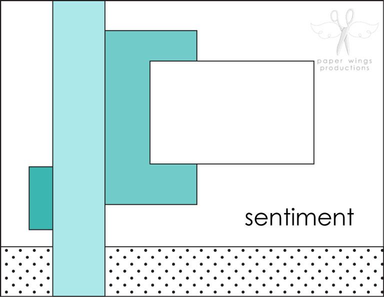
It's time to share another Paper Wings Flight Plan Sketch.  Today, I'm showing samples for Mission 004.


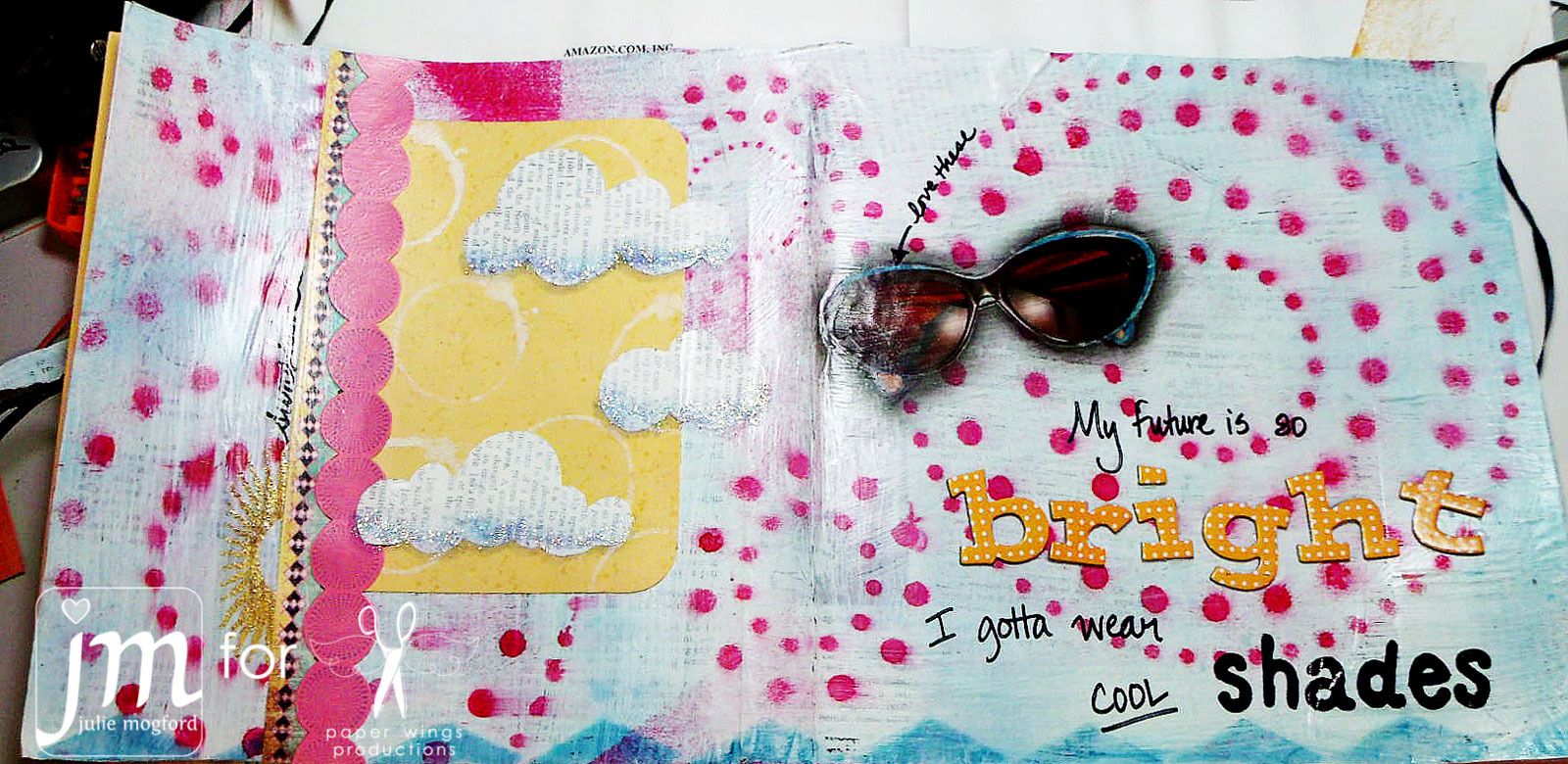
I have two very different samples today.  The first one is a mixed media piece from my art journal.  It has so much going on, and I love the yellow and pink with the hint of aqua.  I think I use these three colors often, but they look happy on here.


Details:
1.  Background - glue dictionary paper, light coat of white paint or gesso and dry.  Spritz aqua sprays.  Add pink sprays with stencil.
2.  Use Phonograph stamp from Lyrics set UPSIDE-DOWN to stamp triangle / zig zag border.
3.  Add patterened paper strip vertically.  Stamp dot pattern on pink paper in a stripe and cut around "circles"
4. Stamp and emboss sun (from Earth and Sky)with glittery embossing powder (bottom left)
5. Stamp circle and dot texture stamps to yellow paper.  Round corners and adhere to page.
6. Cut cloud shapes from dictionary paper.  Adhere clouds to page and add light blue stickles to bottom of clouds.
7. Cut and glue sunglasses from magazine to page.
8. Add thickers and use Solid Whimsical Alphabet stamps to emphasize parts of the title.  Use a sharpie marker to finish sentiment and title.


Supplies for bright art journal page
Stamps: Earth and Sky, Backgrounds, Art Textures, Lyrics and Solid Whimsical Alphabet
Ink: Memento in tuxedo black by Tsukineko, Distress Inks by Tim Holtz/Ranger, Sprays by Tattered Angels (Electric Blue and Trunk Bay). Pink is mixed.
Paper: Basic Grey
Cardstock: Stampin' Up!
Tools: Sharpie, We R Memory Keepers Corner Chomper, Stencil, charcoal pencil, glue stick and Mod Podge
Embellishments: Thickers, Stickles, sunglasses by Betsy Johnson from Oprah Magazine, Egyptian Gold EP by JudiKins


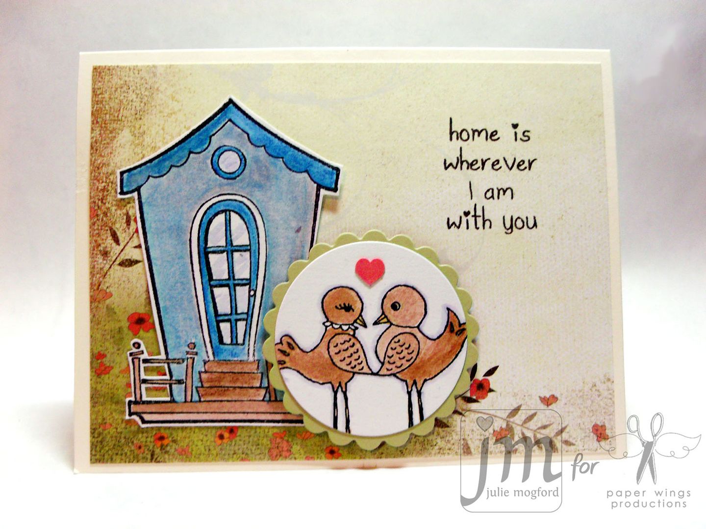
Next I have a birthday card for Carrie - our fearless leader - tomorrow is her birthday.  I hope it is a great one!


I love that this is one of those cards that could be great for just about any sentiment and any color scheme!  These colors are some of Carrie's favorites, and I thought they would work well together.  The main flower, white flower and orange flower all came from the Flower Power set. I love it when a stamp set provides me with multiple elements to complete a card!

The Details:

1. Adhere strip of paper to bottom of 4.25 x 5.5 inch card.
2. Stamp and cut out Lace Border stamp from yellow paper.
3. Stamp and emboss small flower stamp on textured gold paper. Adhere behind straight edge of border and then adhere both to card base.
4. Cover small tag in dictionary paper, ink paper and edges and stamp flower in orange. Cut small circle for hole and add ribbon.
5. Use markers to color large flower directly on rubber. Spritz with water and stamp. Cut around flower and adhere to tag and flower with foam dots to card base.
6. Stamp sentiment in brown ink. NOTE: I cut my sentiments apart when I want them to fit "just right". This sentiment is from a longer stamp.
7. Add 3 brown pearls.


Supplies for happy birthday / Mission 004
Stamps: Lace Border, Flower Power, Sayings and Sentiments

Ink: Colorbox Chalk Ink - Tangerine and Chestnut Roan, Distress Ink - Shabby Shutters and Peeled Paint, Stampin' Up! Craft Ink - Whisper White, Distress Markers (Wild Honey, Mustard Seed, Spiced Marmalade, Tea Dye, Walnut Stain, Shabby Shutters, Crushed Olive, Peeled Paint)
Pattern Paper: Basic Grey (yellow and green), dictionary paper, textured gold paper from stash
Cardstock: Neenah Papers in solar white
Tools: We R Memory Keepers - Cropadile (hole punch),
Embellishments: pearls and ribbon - stash, SU! Whisper White Embossing Powder


We'd love to see you join in on the Flight Plan sketches.  Submissions are due this month on July 31st and participants are eligible to win a free stamp set from Paper Wings Productions. 

For more details about the Flight Plan - check this post.

If you haven't checked out our newest video, check out this post, or see it on You Tube here.


Thanks for dropping by and I hope you come back soon!

Julie

A new video for Paper Wings Productions

Hi all!

It has been awhile since I have had a chance to blog here, but I have several things planned to share with you.  For this post, I'd like to share a video I just created for Paper Wings Productions - a new stamp company where I design stamps and create samples and make videos too.  I brought together my love of crafting, and one of my technology lessons I use at school - stop motion animation, to create this fun new video. 


It took some time, I'll tell you that.  Taking photos, cutting out props, photo editing, hunting down the music, video editing and now - I think it turned out pretty well!

Paper Wings Productions is a small stamping company that makes great stamps for various card, scrapbooking, mixed media projects and more.  Take a look at their online shop (and maybe even buy a few of your favorites) and you will be amazed at the designs and variety. 

The projects in the video are created by myself and Shay.  For more of our projects, check out the Aviary too.

Happy Stamping!

Julie

Wednesday, July 4, 2012

Happy 4th and other Fun News!

I'm a little behind on my posting - ok, really behind on my posting.  In fact, don't be too surprised if I post several times today.  Walter has been keeping me busy, and I thought I had all of this time to create, photograph and post, instead, I've been tending to him, and all the stuff I let pile up during the last months of school.  Even as I write this, I'm stopping to keep Walter out from under my chair and away from chewing on cords.

I do have a few things to share today.  First - I have an Independence Day card - a la Katy Perry!


I used some sprays, glitter embossing powder, and a few of my paper wings productions stamps and came up with this fun card! 


"firework" is stamped with the Solid Whimsical Alphabet set and the "sparklers" were created using stamps from the Hanging Stars set designed by Liz Allen. I hand cut a banner strip and finished the sentiment in my own handwriting.  This is a fun little card. If you would like to read more about it or see more close up pictures, check out this post on The Aviary blog.


Stamps: Hanging Stars and Solid Whimsical Alphabet
Ink: Memento in tuxedo black by Tsukineko, Distress Inks by Tim Holtz/Ranger
Cardstock: Stampin' Up!
Other:
Dylusions Sprays - London Blue and Postbox Red by Ranger
Embossing Powders - Aegean Silver, Egyptian Gold and Rockin' Red from Judikens
Pen - Stampin' Up! Journaling Pen


Also - a couple of my cards have been acknowledged and celebrated by some other fellow crafters.  The first is a sketch challenge blog called iSpy Sketches, and Kim Teasdale (blog administrator and stamper extraordinaire) approached me about using one of my cards as inspiration for one of her sketch challenges.  Check out the post here to see the official sketch layout and some samples created by the design team.  This is the card she used for the sketch inspiration and I was really excited because that was a fun card to make. I hope the participants enjoy using the sketch and I think the "special agents" did a phenomenal job!


The other acknowledgement was on Splitcoast where this card was named as a favorite of the week (post #9) by fellow Splitcoast Stamper Vicki (vdm gallery) who is a great stamper herself.


Ladies - I'm honored.  Thanks for making my week!  And, I hope everyone has a fabulous 4th of July!


Julie


Tuesday, June 26, 2012

PWP stamp review - Wings and Things

Hi y'all

I'm taking an opportunity to share some card samples I've made in the last few months for paper wings productions. I realized that I never got a chance to share them here on my blog.  So - here is the first installment -- Wings and Things!  Hope you enjoy them!


I embossed the Butterfly Panel onto watercolor paper with clear EP, and then used various sprays to create the colorful background. The stampset also includes a sentiment, but I only wanted half of it, so I cut the stamp in half to get more use out of it.  It will be simple enough to put back together on a clear block.  This is also embossed, but using white EP.

Stamps: Butterfly Panel 
Ink: Versa Mark by Tsukineko
Cardstock: Stampin' Up!, Watercolor Paper
Patterned Paper: Basic Grey
Other: Ink Sprays - various companies, silver flat back beeds, embossing powder in Crystal Clear and Whishper White from Stampin' Up!


I liked the look of the previous card so much that I think the "feel" of it carried over a little to this card.  The crane was stamped and watercolored, and matted with black and then again with the textured gold paper. I also came across this pretty paper from Memory Box (few years old - I'm a big time hoarder of my pretty papers).  I like the flourish (of course) but also the paper's slight wood grain appearance. 

Stamps: Crane Panel
Ink: Versafine (black) by Tsukineko
Cardstock: Stampin' Up!, Watercolor Paper, Gold textured paper (stash)
Patterned Paper: Memory Box
Other: Caran d'Ache watercolor crayons, black grosgrain ribbon, black gemstones


This Wings n' Things card was a result of playing with supplies and the layout just seemed to evolve.  I knew I wanted to use this Home Tweet Home set, but wasn't quite sure how to put it all together.  I used my watercolor crayons again, and found this very sweet Memory Box paper, and the scale of it made it look like the birdhouse was really in a garden setting.  That tiny heart is a Marvy punch and I love using it, but sometimes forget it is in my drawer.  So sweet with the love birds. 


Stamps: Home Tweet Home
Ink: Versafine (black) by Tsukineko
Cardstock: Stampin' Up!
Patterned Paper: Memory Box
Other: Caran d'Ache watercolor crayons, copic marker, foam adhesive.


Thanks for stopping by!
Julie


Sunday, June 24, 2012

look at our new little friend

So, this morning, Davis suggested that we go look at some puppies at a local pet store. We looked at several different cute dogs today.  A Shiba Inu, Cocker Spaniel, two different Shih Tzu and a Papillon.  All of these were so cute, but I fell in love with this little guy and I think Davis did too!


He's only 11 weeks old, and so cute, especially when he runs.  He was running in the grass "chasing" Davis.  Right now, he is sitting on my shoulder in the crook of my neck, and probably really needs a nap since we have been with him for several hours now.


Do we look alike?  haha!  Currently the name could be Sir Walter, but I want a middle name too.  Oddly enough, in his pedigree there is a pet with WINDSONG in his name.  I thought of Walter, because I love Walter Bishop from the TV show Fringe. Another idea was Sheldon {from Big Bang Theory},  but I'm not too sure about that.

If you have any good ideas, let us know.  I could always name him Enzo, but I think someone might not be too happy with me.....just kidding :)

Never had a puppy before.  I'm excited and nervous...wish me luck!

Julie

Tuesday, May 22, 2012

Oh Baby!

Hi there!

Just wanted to share a baby card I made recently for a friend at work.  We had the shower today, and she is having a girl and she got some really great things.  I wanted to make her a fun baby card and new the colors would be pink and green. 

I did have some help on this card - lots of various inspriation bits came together to create what you see below.  I'm not always the best at mixing patterns, and worried a little that this card might have a bit too much going on, but I threw caution to the wind and "went for it".


So - where did I get my inspiration?  A few places really. 

1.  Paper Wings Productions Flight Plan Mission 002 - check out the post here for more info on how you can join in on the fun!  I turned my card as a portrait, and I swapped the image and sentiment.


2.  Paper Wings stamps - of course!  I looked through my stamps and thought of several different options for making a baby card, and I chose to use the Details Framer, Whimsical Alphabet, and Birds of a Feather.  These are great sets to use together.

3. Basic Grey Paper - the background paper was a must.  I've been hoarding my Basic Grey favorites for toooooooo long, and it is about time I use them and enjoy them!  I love this paper for it's whimy and it's colors.  So pretty! {Urban Prairie "Bountiful"}

4. Splitcoast Gallery - I was strolling through looking for inspiration and I saw this really great card from Deb Fearns (go check out her blog), who graciously allowed me to share it with you here.  I liked the little banner flags with the hearts beneath them and thought that would work perfectly with the Flight Plan Mission - unfortunately, the heart punch I have didn't provide a small enough heart, so I added my hearts on top of each banner strip.  I really like this card very much - I plan to make another version of it as soon as I can, including the silver bling and banners and hearts.  So clean and so cute!  Thanks again Deb!


Hope you liked the post today, and maybe found a little inspiration too.  Now that school is almost over, I am really looking at spending much more of my time crafting! And looking forward to a little crafting this weekend when my parents come in for a visit!  Yea!

Happy Stamping!


Sunday, May 13, 2012

Happy Mother's Day!

Today is Mother's Day,  and I hope you are getting to spend it with those you love.  Missing my family, but I called my Mom this morning and we had a great chat.  Looking forward to the possibility of seeing her by the end of the month.  I used the Flight Plan Mission 002 template as a guide for all of the elements of this project. 


Girft Tag

Gift Bag


Wall Decor


Close Up Panel 1


Close Up Panel 2


Close Up Panel 3


The Details:  Stamps are from Paper Wings Productions - Flourish Fun 2 (birds and backgrounds), Details Framer (frame), Life Framer (border), Snapshot Framer (tag sentiment), Banner set (bag sentiment). 

I used my Silhouette digital cutting machine to cut out all of the birds and branches.  I colored them with distress ink while they were still on the cutting mat.  I'm still a novice at using the Silhouette, but getting a little better each time.

I hope you have a great Mother's Day! Love you Mom!  You are the best!!!

Julie

Monday, May 7, 2012

A Sad Day

Our sweet dog Nicolae passed away this morning just before 7am at the ripe old age of 11years old.  Apparently this is very old for German Shepherds. This is one of the few pictures he would actually pose for - most of the time he just "couldn't be bothered" to pose for the camera, but prefered to turn away when you tried to take his picture.  Here he is in the laboratory (our office/craft space).   He was such a loyal, happy and friendly dog and we will miss him dearly. 

Monday, April 30, 2012

A Cut Above - day 7

I just love learning something that is so great, and so simple, and to top it off, it gives you something more you can do with all of those dies.  This technique uses the back of the side of a spellbinders die along with silicone mats to emboss the cardstock creating an amazing looking frame.  It is a little tricky figuring out how much or how little thickness of shims you need to get the embossed image and not break your machine.  Tread carefully - but ohhh, what a reward!


I thought my coffee travel cup from Frothy Concoctions fit perfectly here and used paper piecing and white embossing to come up with a cute card for a friend.  This card came together in a flash, even for me (I tend to take way to long to make my creations). 

This was the end of our traditional die cutting techniques, and next we will be using the Silhouette machine.  I can't wait to get this out and play.  It's been tucked away for too long.

See you soon!
Julie

A Cut Above - day 6

Day 6 - Embossing with folders and dies.  These techniques were great, but I just couldn't seem to decide what to do - and then.... I remembered a card I saw on Splitcoast Stampers.  This is the beautiful card by Angie Leach that inspired both the layout and the technique I used on my card. I was in love with the depth this faux patina created and I had been wanting to try this on my own.  She has a tutorial over at her blog, and her technique uses Stampin' Up! inks.  I chose to use my distress ink pads for this technique, and it doesn't have quite the same beautiful depth of hers, but I do like the results.


I used the postage embossing folder from Tim Holtz' collection and several shades of ink (antique linen, scattered straw, dried marigold, vintage photo, walnut stain - maybe more).  The border is a fiskars punch and the label is a spellbinders die, sprayed with a moonshadow mist with copper pearl accents.  Paper Wings Melange 5 Architecture set provided the focal image and the copper accent, and the sentiment is a rub on from Stampin' Up!  


I was looking at this set and saw the small stamp with the writing plume and it made me think of old letter writing and wax seals.  So, I used some embossing ink sponged on some paper and embossed copper embossing poweder in about 6 layers to get the depth that I was looking for.  I put the rubber stamp into versamark ink to provide a "non-stick" surface to the stamp so it wouldn't get stuck during the impression.  I then trimmed the image and used a foam dot to add it to the card.  I think it makes a fun accent.  I haven't done that technique in years and I'm happy with the results.

I hope this inspires you to look at your stamps in a new way.  Happy Stamping!

Julie


A Cut Above - Bonus Day

On the weekend, the teachers for A Cut Above (Kristina Werner, Jennifer McGuire and Nichol Magouirk ) provided us with a Bonus lesson - this one was about using negative space.  This would mean that you would use the paper that you have die cut the shapes from instead or along with the actual die cut pieces.

This is my take on this technique.  I actually started with a long card and had more circles, but due to the size of the circle, I couldn't get as many on the card as I wanted.  I decided to cut down the kraft cardstock so that there were only three holes.  This paper is adhered with foam dots to raise it off the surface and give it more depth. 


I used the heart stamp from one of the Paper Wings  coffee sets - Frothy Concoctions. I actually stamped these by marking the stamp area using a pencil and then erasing before adhering the kraft cardstock.  I used Distress Markers to color both the hearts and the letters from the Whimsical Pattern Alphabet set. to get this coloring effect I used two markers in the same hue but one light and one dark.  I took the darker marker and put some ink down on my craft sheet and then using the lighter marker, I picked up the darker ink, and colored in the bottom of the letter and kept blending as the darker color "ran out" leaving the lighter color marker at the top.  I cut the letters out, added them with a glue pen.  The final element - Rock Candy Stickles !!  I love the subtle sparkle it gives. 

I think this card is great for a guy - it says it all, but it isn't too girly - you know what I mean?  I also think these letters are great fun to add a variety of projects.  And, it was nice using the negative space for a change instead of putting it in my scrap stash for later.  This class has so many great ideas!

happy stamping!

Julie

A Cut Above - day 5

I don't know about you, but when I grab my die cutting machine, I typically think of cutting paper.  In the A Cut Above class, the day 5 assignment was to cut materials other than paper.  I chose to cut sticky back canvas.  I thought there could be a problem with fraying, but the cut was actually really good.  I started by stamping flourishes from Paper Wings Productions Flourish Fun 2 set using the Snow Cap paint dabber onto the canvas. 

Two Notes: 1. I had placed the sticky back canvas directly to my non-stick craft sheet for this application.  Then I used a Peeled Paint distress stain to color the canvas and it resisted the paint.  2. When using an acrylic paint with your stamps, you need to wipe them clean immediately to protect your stamps.  If the paint dries, it is near to impossible to remove it.


After drying with a heat tool, I peeled the canvas off the craft sheet and stuck it on a manila tag to give it some stability (for fluffing the wings later) and then cut it with a butterfly die from Stampin' Up! This effect was nice, but after talking to Shay, I followed her advice and added some yellow gold lumiere paint to the center of the butterfly, brushing the paint out toward the wings, and then lightly brushed the gold paint around edges of butterfly too.  The antennae are created from two more stamps in the Flourish Fun 2 and the "tail" is a flourish from Flourish Fun 1.  I used some black gemstones from the body to finish it off.

I painted the background with a partial cloud stencil and a mixture of 2 shades of blue and white paint sponged to create a sky.  The sentiment (from the Butterfly Panel set)  is actually the second half of a stamp that is embossed in white. I cut the banner and topper myself.  The gold is even nicer in person.

I love doing these assignments because I keep trying to play with more of my supplies that I wouldn't typically use on cards.  I'm definitely starting to step out of the box. Maybe you can join me out here - it's a great place to create!

Julie


Sunday, April 29, 2012

A Cut Above - day 4

It's Day 4 for A Cut Above and the lesson was about partial die cutting.  I really loved the samples they provided, but had some trouble coming up with what I wanted to create using the dies I had. I came up with an idea to use my circle dies on the end of rectangles to give them a different look.  This is a similar effect to maybe a rectangle with a rounded corner, but a little different. I decided on the size of the circles, measured their diameters, and used that measurement to cut the widths of the patterned papers.


I used two different stamp sets from Paper Wings - the telephone and hello sentiment are from Vintage Technology - another set designed by Lissie Girl, and the zig zag border stamp from the Day Framer set designed by Post Script Press aka Shay!  I love the way it looks here behind the phone, almost symbolizing the phone ringing. :)


I stamped it directly on the patterned paper, and stamped it again on another paper so I didn't have to cut out the cord. I colored the phone using distress markers and outlined it with a copic marker for a shadow. I used the white distress marker for the highlights and the numbers on the dial.  In hindsight I think I would have also added some glossy accents to this phone.  Think I still will before sending it.  I used a pen to write the numbers again because they were just a little too faded from the opaque marker.  This marker goes on fairly light, but gets more white as it dries.  Nice effect.

I think I'll try this die cut technique again - it was easy, and I like this new look.

Happy creating!

Julie


A Cut Above - day 3

Hi everyone!

I'm really glad I decided to take this A Cut Above class.  I haven't used my cuttle bug that much over time, and these assignments are really getting me to try some new things. The Day 3 lesson was about creating shaped cards.  I had several large dies that I thought about using, but opted for my large scalloped square die from Stampin' Up!.  Can you believe this was only the 2nd time I had used it?  I really need to use my tools more.


I used a Spellbinders square die to cut the hole in the center, making a frame for my scene.  This card uses the Frida por Vida stamp set from Paper Wings Productions, designed by Handmade by Lissie Girl. The curtains are paper pieced from a Basic Grey red distressed paper (the frame is from BG "Out of Print").  I needed a background to stamp Frida, but white or ivory seemed to stark, so I looked in my stash and found this book paper that I had painted with some gesso.  I stamped her using Archival ink and colored her in using my new Distress Markers.  Isn't she cute??


I took the Tim Holtz Online Card Class too, but didn't have the distress markers when we were practicing marker techniques.  I couldn't wait to get them.  I really love how they look on top of gesso.  They have a beautiful translucent quality, and the blend very nicely.  I will definitely use them on gesso again, and I can't wait to try them on watercolor paper too.


Inspired yet?  As my husband says - go make something pretty!
Keep checking back for more A Cut Above / Paper Wings samples!

Julie


A Cut Above - day 2

Hello again!

Just sharing another card made for the Online Card Classes - A Cut Above series.  Day 2 assignment was to create a window using dies.  I used the nestabilities dies to cut a circle window and a scalloped frame.  The patterned papers are from Basic Grey and the stamps are from Paper Wings - Lissie Girl designs - Hey Cupcake and Banner stamp sets. Strawberry cupcake with chocolate icing - YUM!!!!


I love how the cupcake wrapper came out too with the diagonal stripes.  This card makes me happy :)
Too bad that cupcake is only paper...

Happy Stamping!
Julie

A Cut Above - day 1

It's been too long - I've been a little busy, and the end of the school year always seems to drain me.  But, I've found some energy these last few days, and I've been participating in the Online Card Class - A Cut Above.  It's all about die cutting.  The first week is using traditional die cutting systems.  I'm using a Cuttle Bug and various dies. 


Day 1 assignment - I decided to comine two assignments into one. In the class our assignment was to "step up your die cutting" and on  the Aviary blog we wanted to create a sample for Fiesta! - if you aren't from San Antonio, here is a little info about it. {Bonus: I'm a Houston girl, so I still can't believe we get this day off every year - yea :) }

Fiesta® San Antonio started in 1891 as a one-parade event. It evolved into one of this nation’s premier festivals, with an economic impact of more than $284 million for the Alamo City. The funds raised by official Fiesta events provide services to San Antonio citizens throughout the year. So you could say that Fiesta never ends! Fiesta really is one of America’s truly great festivals. It began as a way to honor the memory of the heroes of the Alamo and the Battle of San Jacinto. That commemoration still takes place. But over the past century and more, Fiesta has grown into a celebration of San Antonio’s rich and diverse cultures. 2012 marks Fiesta’s 121st anniversary. [http://www.fiesta-sa.org/about-2/ ]


I looked through my Paper Wings stamps and found several things that worked out perfectly. First, I used the Happy Day set to create flags/banners and it turns out that these stamps fit with my Papertrey Ink Banner Builder Dies that Shay bought for me. I also used the streamers from that set which worked out well for the theme. Then I used the Deep in the Heart of Texas set for the Alamo, Sombrero and the Fiesta sentiment.


The background is 3 kinds of spray ink to give the look of sky and land.  I used my new distress markers and some distress inks and archival ink for the images.  Of course I had to add some STICKLES - yellow, fruit punch and mermaid - the fiesta sentiment looks awesome with mermaid on it.  Since Davis is a native to San Antonio, I asked him what it needed.  He said it needed confetti too, so I cut up some various papers really small and I think it makes it look so fun!

Hope you enjoyed looking and hope it inspires you to create something too!

Julie