Pages

Monday, April 30, 2012

A Cut Above - day 7

I just love learning something that is so great, and so simple, and to top it off, it gives you something more you can do with all of those dies.  This technique uses the back of the side of a spellbinders die along with silicone mats to emboss the cardstock creating an amazing looking frame.  It is a little tricky figuring out how much or how little thickness of shims you need to get the embossed image and not break your machine.  Tread carefully - but ohhh, what a reward!


I thought my coffee travel cup from Frothy Concoctions fit perfectly here and used paper piecing and white embossing to come up with a cute card for a friend.  This card came together in a flash, even for me (I tend to take way to long to make my creations). 

This was the end of our traditional die cutting techniques, and next we will be using the Silhouette machine.  I can't wait to get this out and play.  It's been tucked away for too long.

See you soon!
Julie

A Cut Above - day 6

Day 6 - Embossing with folders and dies.  These techniques were great, but I just couldn't seem to decide what to do - and then.... I remembered a card I saw on Splitcoast Stampers.  This is the beautiful card by Angie Leach that inspired both the layout and the technique I used on my card. I was in love with the depth this faux patina created and I had been wanting to try this on my own.  She has a tutorial over at her blog, and her technique uses Stampin' Up! inks.  I chose to use my distress ink pads for this technique, and it doesn't have quite the same beautiful depth of hers, but I do like the results.


I used the postage embossing folder from Tim Holtz' collection and several shades of ink (antique linen, scattered straw, dried marigold, vintage photo, walnut stain - maybe more).  The border is a fiskars punch and the label is a spellbinders die, sprayed with a moonshadow mist with copper pearl accents.  Paper Wings Melange 5 Architecture set provided the focal image and the copper accent, and the sentiment is a rub on from Stampin' Up!  


I was looking at this set and saw the small stamp with the writing plume and it made me think of old letter writing and wax seals.  So, I used some embossing ink sponged on some paper and embossed copper embossing poweder in about 6 layers to get the depth that I was looking for.  I put the rubber stamp into versamark ink to provide a "non-stick" surface to the stamp so it wouldn't get stuck during the impression.  I then trimmed the image and used a foam dot to add it to the card.  I think it makes a fun accent.  I haven't done that technique in years and I'm happy with the results.

I hope this inspires you to look at your stamps in a new way.  Happy Stamping!

Julie


A Cut Above - Bonus Day

On the weekend, the teachers for A Cut Above (Kristina Werner, Jennifer McGuire and Nichol Magouirk ) provided us with a Bonus lesson - this one was about using negative space.  This would mean that you would use the paper that you have die cut the shapes from instead or along with the actual die cut pieces.

This is my take on this technique.  I actually started with a long card and had more circles, but due to the size of the circle, I couldn't get as many on the card as I wanted.  I decided to cut down the kraft cardstock so that there were only three holes.  This paper is adhered with foam dots to raise it off the surface and give it more depth. 


I used the heart stamp from one of the Paper Wings  coffee sets - Frothy Concoctions. I actually stamped these by marking the stamp area using a pencil and then erasing before adhering the kraft cardstock.  I used Distress Markers to color both the hearts and the letters from the Whimsical Pattern Alphabet set. to get this coloring effect I used two markers in the same hue but one light and one dark.  I took the darker marker and put some ink down on my craft sheet and then using the lighter marker, I picked up the darker ink, and colored in the bottom of the letter and kept blending as the darker color "ran out" leaving the lighter color marker at the top.  I cut the letters out, added them with a glue pen.  The final element - Rock Candy Stickles !!  I love the subtle sparkle it gives. 

I think this card is great for a guy - it says it all, but it isn't too girly - you know what I mean?  I also think these letters are great fun to add a variety of projects.  And, it was nice using the negative space for a change instead of putting it in my scrap stash for later.  This class has so many great ideas!

happy stamping!

Julie

A Cut Above - day 5

I don't know about you, but when I grab my die cutting machine, I typically think of cutting paper.  In the A Cut Above class, the day 5 assignment was to cut materials other than paper.  I chose to cut sticky back canvas.  I thought there could be a problem with fraying, but the cut was actually really good.  I started by stamping flourishes from Paper Wings Productions Flourish Fun 2 set using the Snow Cap paint dabber onto the canvas. 

Two Notes: 1. I had placed the sticky back canvas directly to my non-stick craft sheet for this application.  Then I used a Peeled Paint distress stain to color the canvas and it resisted the paint.  2. When using an acrylic paint with your stamps, you need to wipe them clean immediately to protect your stamps.  If the paint dries, it is near to impossible to remove it.


After drying with a heat tool, I peeled the canvas off the craft sheet and stuck it on a manila tag to give it some stability (for fluffing the wings later) and then cut it with a butterfly die from Stampin' Up! This effect was nice, but after talking to Shay, I followed her advice and added some yellow gold lumiere paint to the center of the butterfly, brushing the paint out toward the wings, and then lightly brushed the gold paint around edges of butterfly too.  The antennae are created from two more stamps in the Flourish Fun 2 and the "tail" is a flourish from Flourish Fun 1.  I used some black gemstones from the body to finish it off.

I painted the background with a partial cloud stencil and a mixture of 2 shades of blue and white paint sponged to create a sky.  The sentiment (from the Butterfly Panel set)  is actually the second half of a stamp that is embossed in white. I cut the banner and topper myself.  The gold is even nicer in person.

I love doing these assignments because I keep trying to play with more of my supplies that I wouldn't typically use on cards.  I'm definitely starting to step out of the box. Maybe you can join me out here - it's a great place to create!

Julie


Sunday, April 29, 2012

A Cut Above - day 4

It's Day 4 for A Cut Above and the lesson was about partial die cutting.  I really loved the samples they provided, but had some trouble coming up with what I wanted to create using the dies I had. I came up with an idea to use my circle dies on the end of rectangles to give them a different look.  This is a similar effect to maybe a rectangle with a rounded corner, but a little different. I decided on the size of the circles, measured their diameters, and used that measurement to cut the widths of the patterned papers.


I used two different stamp sets from Paper Wings - the telephone and hello sentiment are from Vintage Technology - another set designed by Lissie Girl, and the zig zag border stamp from the Day Framer set designed by Post Script Press aka Shay!  I love the way it looks here behind the phone, almost symbolizing the phone ringing. :)


I stamped it directly on the patterned paper, and stamped it again on another paper so I didn't have to cut out the cord. I colored the phone using distress markers and outlined it with a copic marker for a shadow. I used the white distress marker for the highlights and the numbers on the dial.  In hindsight I think I would have also added some glossy accents to this phone.  Think I still will before sending it.  I used a pen to write the numbers again because they were just a little too faded from the opaque marker.  This marker goes on fairly light, but gets more white as it dries.  Nice effect.

I think I'll try this die cut technique again - it was easy, and I like this new look.

Happy creating!

Julie


A Cut Above - day 3

Hi everyone!

I'm really glad I decided to take this A Cut Above class.  I haven't used my cuttle bug that much over time, and these assignments are really getting me to try some new things. The Day 3 lesson was about creating shaped cards.  I had several large dies that I thought about using, but opted for my large scalloped square die from Stampin' Up!.  Can you believe this was only the 2nd time I had used it?  I really need to use my tools more.


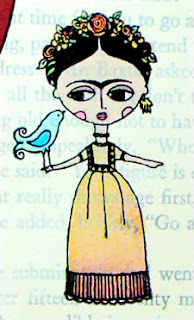
I used a Spellbinders square die to cut the hole in the center, making a frame for my scene.  This card uses the Frida por Vida stamp set from Paper Wings Productions, designed by Handmade by Lissie Girl. The curtains are paper pieced from a Basic Grey red distressed paper (the frame is from BG "Out of Print").  I needed a background to stamp Frida, but white or ivory seemed to stark, so I looked in my stash and found this book paper that I had painted with some gesso.  I stamped her using Archival ink and colored her in using my new Distress Markers.  Isn't she cute??


I took the Tim Holtz Online Card Class too, but didn't have the distress markers when we were practicing marker techniques.  I couldn't wait to get them.  I really love how they look on top of gesso.  They have a beautiful translucent quality, and the blend very nicely.  I will definitely use them on gesso again, and I can't wait to try them on watercolor paper too.


Inspired yet?  As my husband says - go make something pretty!
Keep checking back for more A Cut Above / Paper Wings samples!

Julie


A Cut Above - day 2

Hello again!

Just sharing another card made for the Online Card Classes - A Cut Above series.  Day 2 assignment was to create a window using dies.  I used the nestabilities dies to cut a circle window and a scalloped frame.  The patterned papers are from Basic Grey and the stamps are from Paper Wings - Lissie Girl designs - Hey Cupcake and Banner stamp sets. Strawberry cupcake with chocolate icing - YUM!!!!


I love how the cupcake wrapper came out too with the diagonal stripes.  This card makes me happy :)
Too bad that cupcake is only paper...

Happy Stamping!
Julie

A Cut Above - day 1

It's been too long - I've been a little busy, and the end of the school year always seems to drain me.  But, I've found some energy these last few days, and I've been participating in the Online Card Class - A Cut Above.  It's all about die cutting.  The first week is using traditional die cutting systems.  I'm using a Cuttle Bug and various dies. 


Day 1 assignment - I decided to comine two assignments into one. In the class our assignment was to "step up your die cutting" and on  the Aviary blog we wanted to create a sample for Fiesta! - if you aren't from San Antonio, here is a little info about it. {Bonus: I'm a Houston girl, so I still can't believe we get this day off every year - yea :) }

Fiesta® San Antonio started in 1891 as a one-parade event. It evolved into one of this nation’s premier festivals, with an economic impact of more than $284 million for the Alamo City. The funds raised by official Fiesta events provide services to San Antonio citizens throughout the year. So you could say that Fiesta never ends! Fiesta really is one of America’s truly great festivals. It began as a way to honor the memory of the heroes of the Alamo and the Battle of San Jacinto. That commemoration still takes place. But over the past century and more, Fiesta has grown into a celebration of San Antonio’s rich and diverse cultures. 2012 marks Fiesta’s 121st anniversary. [http://www.fiesta-sa.org/about-2/ ]


I looked through my Paper Wings stamps and found several things that worked out perfectly. First, I used the Happy Day set to create flags/banners and it turns out that these stamps fit with my Papertrey Ink Banner Builder Dies that Shay bought for me. I also used the streamers from that set which worked out well for the theme. Then I used the Deep in the Heart of Texas set for the Alamo, Sombrero and the Fiesta sentiment.


The background is 3 kinds of spray ink to give the look of sky and land.  I used my new distress markers and some distress inks and archival ink for the images.  Of course I had to add some STICKLES - yellow, fruit punch and mermaid - the fiesta sentiment looks awesome with mermaid on it.  Since Davis is a native to San Antonio, I asked him what it needed.  He said it needed confetti too, so I cut up some various papers really small and I think it makes it look so fun!

Hope you enjoyed looking and hope it inspires you to create something too!

Julie


Friday, April 13, 2012

Paper Wings Flight Plan Challenge

Hi there!

Just wanted to share some exciting news from Paper Wings Productions.  They have just issued a new challenge post called Flight Plan.  It is a guideline for creating a project using PWP stamps.  Here is a peak at the sketch, but check out this post at the Aviary blog for all of the details.  And, check out the amazing canvas created by Shay!  It is so great!


I like the idea of a Flight Plan because it can be translated into so many different types of projects.  I decided to make a scrapbook page.  It has been so long since I've done a scrapbook page - it took me a while to work on this, not because it was difficult, but because there were just too many supplies in my stash that I wanted to use!  hee hee


I used glimmer mists on the background paper to give it just a little color (shows up more in other images).  Behind the photo, I used some papers with pink and turquoise acrylic paint. The painted paper has some variation in color which I think makes it fit in well with the polka dot patterened paper.


 On the tag I used a flourish and the heart from the Flourish Fun 2 stamp set stamped with chalk ink.  The heart is colored in with prisma color pencils and the dots are accented with Signo white gel pen.


I also used two sentiments from the Framers sets: smile is from the Life Framer set and every day is from the Day Framer set.  I actually put both of these stamps on my block at the same time, lining them up together on the tag, and then pressing the block to keep them straight.  I think they look great together here!


 This fiskars punch is one of my favorites.  I thought it needed a little something extra, and I like the look of sewing, so I used this border stamp from the Details Framer.  I stamped it in versamark and embossed it with SU! whisper white embossing powder.  The sentiment is from a sticker sheet that I cut apart for this layout.  I love how the black stands out against the background. 


Other details: 2012 date stamp is from the Life Framers set, which also has 2013, 2014, and 2015.  Great for projects for years to come.This cute little flower is from the Frida  por Vida set, accented with the same heart from Flourish Fun 2 to create my own border, also colored with prisma pencils.  


The happiness sentiment was created with American Crafts Thickers - I never get tired of these letter stickers.  They are so fun and make me happy.  This green glitter set is one of my favorites.


I hope this scrapbook page inspires you to get crafty.  And, I hope you will join in on the Flight Plan challenge.  I'll be looking for your artwork on the Flickr page.

Happy Stamping!

Julie


Monday, April 9, 2012

Creative Chemistry Week 2

Hello again!

Here are the tags for Creative Chemistry Week 2.  I used Paper Wings Productions stamp sets for all of the tags below.  This was such a great project for me because it felt like playing and I don't think I play with my supplies enough.  It seems like the only time I'm "creating" is when I have something I need to work on, versus just making art for the joy of it.  I'm definitely going to do this more often.

Day 6: Distress Markers - I had to use my Stampin' Up! markers because I haven't gotten my distress markers yet - I still liked most of my results. Can't wait to see the comparison.

a. Stamping with Markers - Butterfly Panel
b. Watercolor with Markers - Birds of a Feather, Texas
c. Blending with Markers - Frida por Vida


Day 7: Embossing

a. Distress Powder Resist - San Antonio Missions, Flourish Fun 1
b. Rusted Enamel - Melange Women 2
c. Nostalgic Batik - Life Framers, Mexican Folk Art, Muertos


Day 8: Paint Primer
a. Crackle Paint Resist - Framers Snapshot, Framers Details, Butterfly Panel
b. Shattered Stains Technique - Flourish Fun 1
c. Dabber Resist Technique - Melange Women, Flourish Fun 2


Day 9: Perfect Pearls

a. Perfect Distress (hard to see, but trust me it's there) - Let's Eat Cake
b. Perfect Distress Mist - Geishas, Melange 3 & 4
c. Perfect Splatter Distress - Melange 3, Melange 4 & 5 Architecture


Day 10: Dimensional Mediums
a. Rock Candy Distress Stickles (pretty sparkle, can see some when photo enlarged) - Melange Women 2 and Melange 4 Architecture.

That is a lot of tags!  These will serve as a great resource for future projects.  I'm so glad I was able to take this class.  If you haven't tried Online Card Classes, they offer some great choices, great tutorials and great prices.


Have you played with your art supplies lately? If not, make a date for yourself this week and have some fun!

see ya later!

Julie

Creative Chemistry Week 1

Hi everybody! 

Hope you all had a great weekend.  I had a nice one.  Few extra days off from work, went to Carrie's Paper Wings Productions Workshop at Stamp Antonio and worked on finishing some projects at home, like the PWP Flight Plan challenge at the Aviary, and the items in this post for the Tim Holtz Creative Chemistry class that I just finished.  Wow - I learned so much about Distress products and techniques that have some amazing results.  In this post you will find the sample tags I created from the first week of class. And of course, I used PWP stamps (listed below the samples) and it was so much fun. Hope you enjoy!

Day 1: Discovery

Day 2: Distress Ink

a. Blended Spritz and Flick - Vintage Technology
b. Brushless Watercolor - Bird Panel

c. and d. Wrinkle-Free Distress - Happy Day


Day 3: Archival Ink


a. Archival Resist - Melange Women 1 & 2, Melange 5 Architecture, Butterfly Panel [no archival inks except black, so used VersaMagic inks - some before and some after]
b. Reflections Stamping - Day Framer
c. Alcohol Ink Agates - Melange 5 Architecture, Flourish Fun 1


Day 4: Re-inkers


a. Layered Misting - Play With Your Coffee
b. Watercoloring with Re-inkers - Butterfly Panel
c. Custom Stamp Pad - Muertos


Day 5: Spray Inks and Stains


a. Stained Kraft Resist - Melange 2 [no kraft resist at home, so used other paper with resist]
b. Stamping with Stains - San Antonio, Lone Star State
c. Marbled Stains - Geishas

In my next post I will share my week 2 tags.
Happy Stamping!

Friday, April 6, 2012

Fabulous Flourishes

Hi there!

Ahhhh....Fabulous Flourishes - try saying that 3 times fast !  Ha Ha!  Flourishes are AWESOME! I really love using them and a few years back I became a wee bit obsessed with them.  I remember taking classes at Stamp Antonio where the teachers were demonstrating their potential and I literally was falling in love with them. 

So, fast forward to December 2010 where I was trying to decide on my word for the One Little Word project (by Ali Edwards) I was starting in January and I looked up the word Flourish - some of the meanings include to be strong and healthy, to be at the height of excellence, to be successful, and to make dramatic sweeping gestures.  Then I checked out the thesaurus and found more interesting meanings like delight, amplify, arrive, develop, and accomplish. I loved how these meanings made me feel about what I wanted to acheieve during the next year so I decided to make Flourish my One Little Word for 2011.  As the year progressed, I was working on designs for Paper Wings Productions and I thought I'd draw my own set of flourishes, some inspired by other flourishes I had seen and others cames from doodling.  I hope you like flourishes as much as I do, and if you haven't used them before, take a look at these samples I made using both Flourish Fun 1 and Flourish Fun 2 sets from Paper Wings Productions.


This Celebrate You card uses three different flourishes: part of one flourish becomes the antennae, another flourish to decorate the wing and a third to show a trail behind the butterfly. The celebrate sentiment comes from the Banner set by Handmade by Lissie Girl, and I added the "you" with silver glitter sticker letters.


The trail and butterfly decoration are both embossed in silver.  The butterfly is die cut with a Stampin' Up! die from book paper sprayed with glimmer mists and adorned with 3 black gemstones. I used glue dots to add the butterfly to the card and lifted the wings for more dimension.


This time, I'm using the flourishes embossed in white on red paper, and then punched and applied with foam adhesive.  The birthday letters are from American Crafts rub ons and wishes is handwritten.  I cut the front of the card a little shorter to add the punched edge and cut a thin strip of black paper to accent it. the punch is glued to the card from the inside so I could line the scalloped edge with teh back of the card. 


This technique is so simple and could be used in a variety of ways.  Think about other shaped punches you could use this with.  Lots of possibilities!


I love pink, and I love this lime peel green, but I really like them together! I had this wonderful satin ribbon from Stampin' Up! in my stash and I love it on this card. 


I really had fun making this image.  I used pieces from the Flourish Fun 2 set to create this flower. One flourish in light green to create a flower stem and leaves look.  Then, I used the extra dotted flourishes from the set in a darker green for a little more dimension.  This set also includes two flower shapes, (one shown here in dark pink), the "small petal" shape (shown in the lighter pink), and several different dot clusters (shown here as pink buds or berries and the yellow stamen on the flower - accented with stickles of course) .  The sentiment is another rub on from American Crafts.


I really liked making this tag.  I had this idea that the swirls should be behind the stars for emphasis and of course I had to frame the tag with them too.  I've used two different color inks for the flourishes to give them more depth. The quote is from Vincent Van Gogh - "For my part, I know nothing with any certainty, but the sight of the stars makes me dream."  Love that!


These stars are die cut from a Stampin' Up! die, inked with Distress ink pads, and then outlined and filled in with Ranger Glossy Accents.  I left this overnight to dry and they really shine!  I used the flourishes again with versamark ink and heat and stick powder to add the Dazzling Diamonds (SU!) glitter for some extra shine and sparkle. This would be a great tag to add to a birthday or graduation gift! 


I hope these samples inspire you and possibly give you new ideas of how to use flourishes.  Come back soon to see my tags I created during the Tim Holtz Creative Chemistry class. 

Have a great weekend!