Pages

Showing posts with label pattern paper. Show all posts

Saturday, November 23, 2013

Winnie & Walter - The Daily Grind Collection, Vol. 1

I've been away for awhile, but have been VERY busy!!!  I should say that Shay and I have been very busy with Winnie & Walter!  Today, I'm happy to share with you our first digital products.

Winnie & Walter present The Daily Grind Collection, Vol. 1

The Collection consists of Journal Cards, Wood Grain circle icons, Elements, Brushes, and Papers created to be used both digitally or as printed elements!


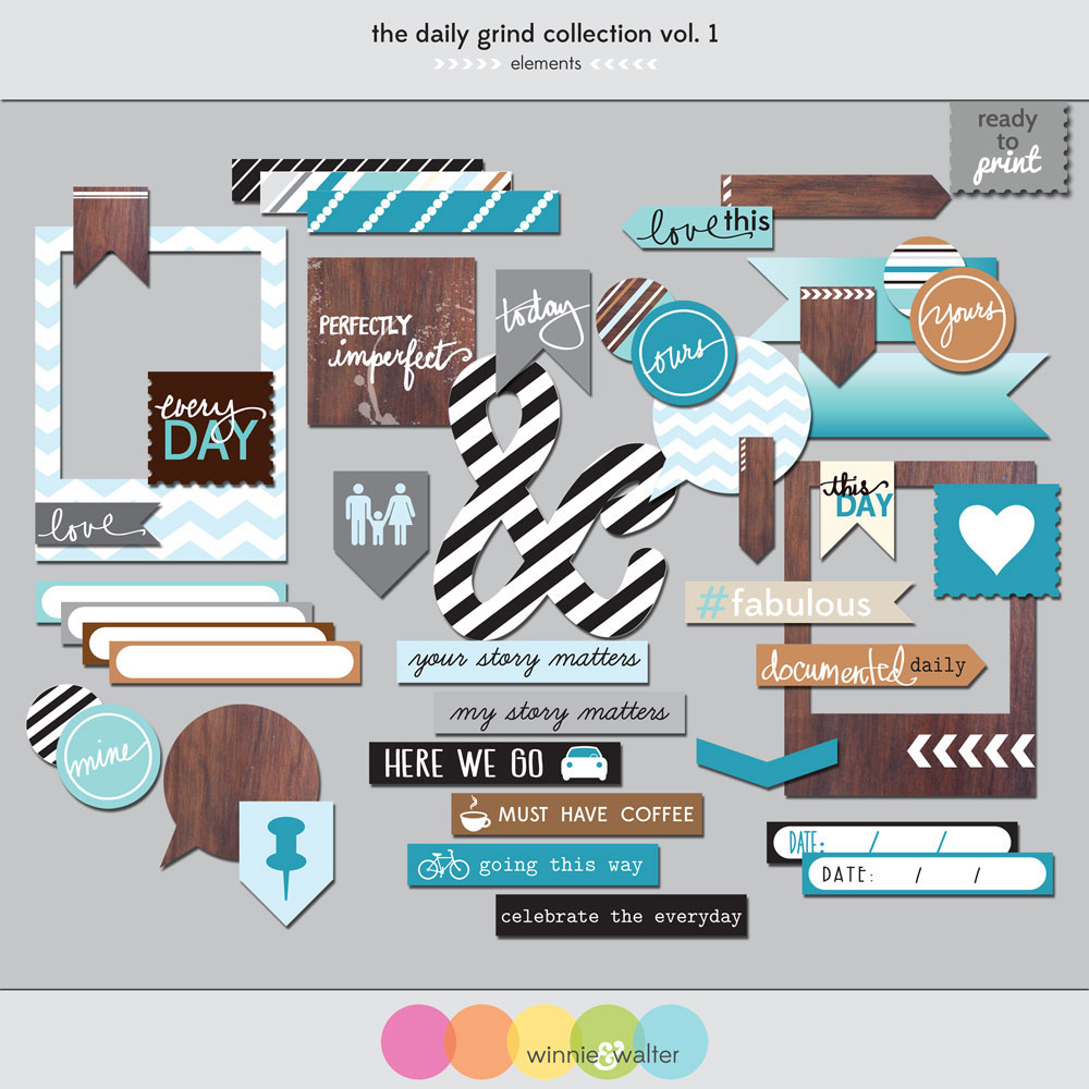
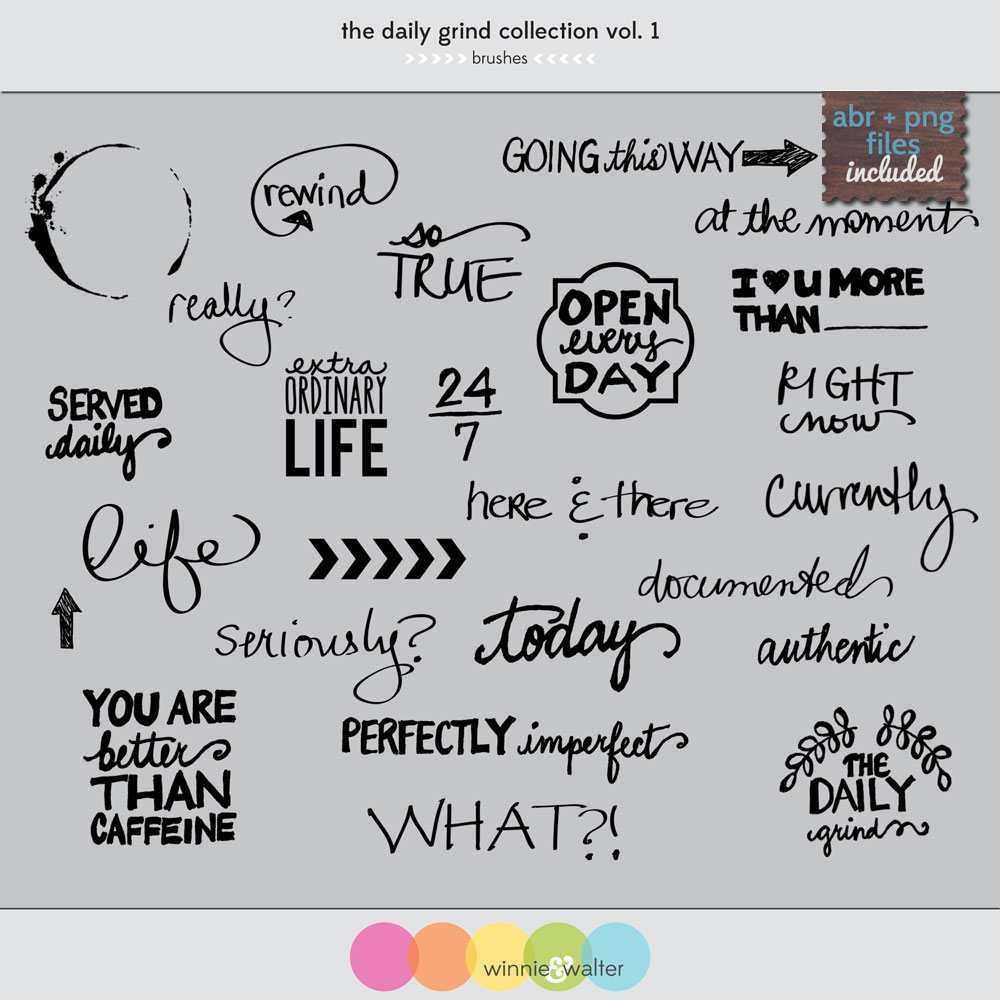


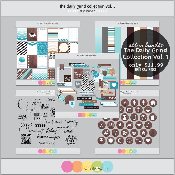
I think what I like most about this collection is the color palette and its versatility.  I can use the elements easily with other things that are already in my stash - and you know I've got quite a lot in my stash.  And, if that wasn't enough, you can get all of these at a reduced price by buying the "All In" Bundle!


And - if you like us on Facebook, then you can get this fun, coordinating Word Tiles Freebie ...
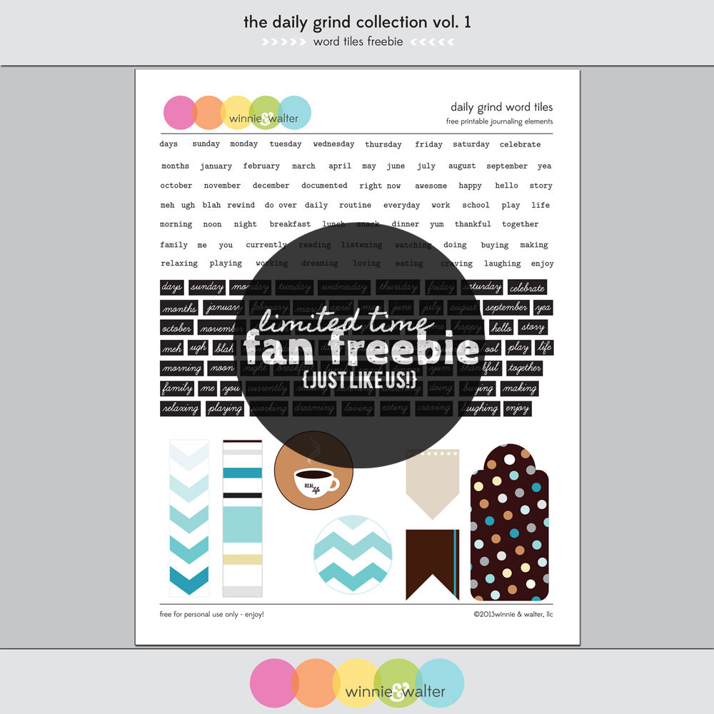

and if you didn't pick up our last freebie, Live Laugh Love, you will find it in the Fan Freebie area of our Facebook page too!  Double Freebie Goodness!!!!


Check out project samples from Shay using the Live Laugh Love freebie.

You can find my samples projects for Live Laugh Love here and here.

Shay has some wonderful creations on the Winnie & Walter blog using The Daily Grind Collection, Vol. 1

It was so fun to actually get a chance to make some projects with this collection after working on the designs.  Here are a few things that I made using the printable PDFs.

jmog_ww_dg_loveyou3-WEBcredit

I was really wanting to use the chevron Polaroid element and the love tab in an unexpected way.

jmog_ww_dg_loveyou2-WEBcredit

I was digging in my stash and found this package from K&Company of fabric flowers and buttons and thought it would be cute on a card as the focal image.  I used foam tape to put the Polaroid frame on the card and then added each layer of the flowers and topped it off with a bejeweled button.  So pretty!  I thought that the love tab would be cute as part of the full sentiment so I added the "you" with these yellow thickers!  Fun Fun FUN!  This card has dimension without being too bulky.


jmog_ww_dg_urfab1-WEBcredit

On this card I wanted to use several of the patterns altogether plus another text strip for the sentiment. I have seen Kristina Werner do this technique several times and I really like it, but I haven't tried it in a long time.  I cut strips in different widths from the patterns included with the journal cards and glued them down side by side on a strip of cardstock and then trimmed to clean up the edges.


jmog_ww_dg_urfab3-WEBcredit

I love the #fabulous sentiment and thought using u and r would be a perfect finish in the bold white Thickers on the chocolate chip cardstock.  I am a little late to the sequin trend, but better late than never.  Shay gifted me several colors of sequins and this felt like a great place to add a little sequin sparkle.

I've been wanting to try my hand at Project Life with digital elements, so I used the various papers, elements, journal cards and brushes to create these layouts. I used the templates (now from the Digital Project Life store) made by Becky Higgins that I first in the Jessica Sprague shop.

jmog_ww_dg_pl1

Journaling: features fonts Zephyr, Statuesque and Notebook by Karla Dudley - love these!
Top row: Grey cardstock, Large chevron circle from the Facebook Freebie (see above), circle elements resized, "currently" and arrow brush. Element strips and postage heart.
Middle row: Kraft cardstock, coffee ring and caffeine sentiment brushes.
Bottom row: More kraft, wood grain icon coffee, striped ampersand.


jmog_ww_dg_pl2

Journaling: More Karla Dudley and Segoe print.
Top row: I typed the date in between the stripes of the 6x4 journal card. Love how this turned out. Days of the week from the Facebook Freebie, date strip from the elements and "seriously?" brush in white with a shadow.
Middle row: Graph paper, currently and teal daily text journal card. Extra ordinary life brush in teal, plus various wood grain icon circles to match journaling.
Bottom row:  I {heart} u more than brush in white with text added.  Photo collage created with PicMonkey - so easy.  The celebrate the everyday sentiment is a single strip, but I cut it apart in photoshop using the rectangle select tool to fit it in the space.

I was cracking myself up on some of these - my faves are the " 'sup" speech bubble for Walter and the Starbucks journaling for Davis. Makes me happy!!! :)

Be sure to check out the Winnie & Walter Blog for more details about The Daily Grind Collection, Vol. 1.  If you like to get the scoop on deals and upcoming products, you can sign up for the newsletter right on our blog.  Want to get this kit now?  Visit us at www.winniewalter.com !

Here are a few other places you can find us: Flickr, Twitter, Instagram, and Pinterest!    I think Winnie and Walter are really enjoying all of the attention they are getting lately!

GIVEAWAY
One more thing going on at the blog right now - sign up to win the whole collection!  Don't you just love free stuff???

Thanks for stopping by!  Happy creating!

Julie

All projects feature The Daily Grind Collection, Vol. 1 by Winnie & Walter.

love you card:
flower elements and button by K&Company, Thickers by American Crafts, pink ribbon by Stampin' Up!, Neenah Solar White cardstock, foam tape, 3 in 1 glue by Beacon, Mono Multi Liquid Glue by Tombow.

u r #fabulous:
chocolate chip cardstock by Stampin' Up!, Thickers by American Crafts, sequins, foam tape, Mono Multi Liquid Glue by Tombow.

project life - nov 4-10 and nov 11- 17 layouts: Karla Dudley fonts, Pic Monkey, Photoshop Elements, Becky Higgins digital templates

Friday, July 19, 2013

Summer Card Camp 2 - Week 2 Day 1 "Thinking of You Always"


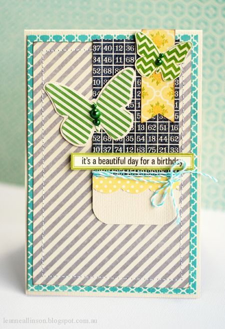
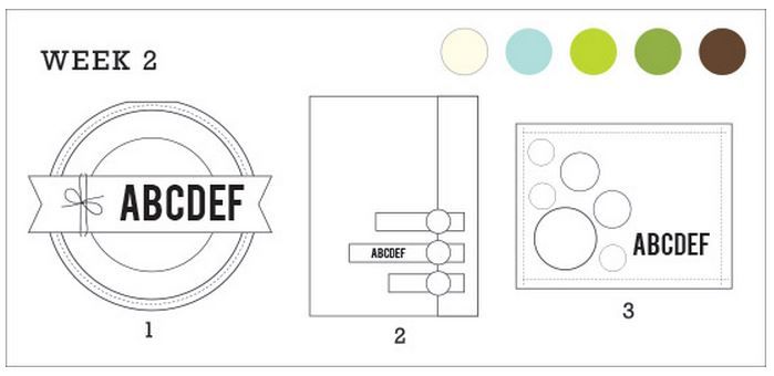
It's week TWO!  New colors and new sketches!  Today, I just used the color pallette to get started with my design and found an oh so cute card on Pinterest by Leeanne Allinson.  Here it is!!

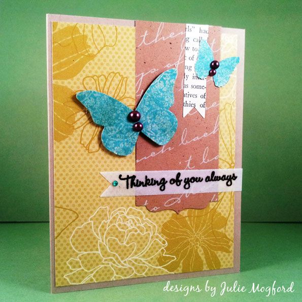
Even some of this weeks colors are in her card too.  Here is my take on this card for the color challenge. My greens still don't look quite right, even after Photoshop. 


Step by Step:
1. Cut pattern paper and adhere to card base.
2. Cut banners and butterflies with die cut machine and / or punches. 
3. Stamp and emboss sentiment on vellum.
4. Adhere both vertical banner strips and butterflies, using foam tape for the larger one.
5. Adhere vellum with vellum glue.
6. Add pearls and gemstone.


What I love about this card: Love the layout and the various patterns and textures working together.  The pearls look great on the butterflies and coordinate with the embossing powder.  This card came together pretty quickly and I would love to do this sketch again - it was fun!


Supplies

Stamps: Thinking of you Always (Hero Arts), Have a delicious birthday! (Rubber Soul)
Ink: Versamark (Tsukineko)
Paper: Crumb Cake and Urban Oasis (Stampin' Up!), book text, aqua and craft pattern from stash
Additional items:  Double Ended Banners Die and Half and Half Die collection (PapertreyInk), Butterfly die (SU!), small butterfly (Martha Stewart), Pearls (Queen & Co.), gemstones (TPC Studio "Ancestral"), Midnight Bronze Obsidian embossing powder(Lindy Stamp Gang), Cuttlebug, Scor-Pal, Tombow tape runner, Recollections foam adhesive, Glue Dots brand for Vellum.

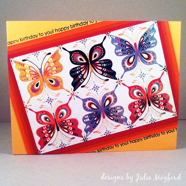
Summer Card Camp 2 - Day 5: Butterfly Birthday - New Color Challenge


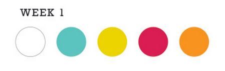
So, I get up early to see what the challenge was for day 5 of Online Card Classes - Summer Card Camp 2. I love color challenges. I looked through our choices and picked this one.

As I am looking through my supplies (yes my Basic Grey collections are begging to be used instead of sitting on the shelf) and I find Ambrosia - Winsome.  Guess what - I think I might be color blind!!!  I shouldn't joke, but the color combo above is NOT the color combo of the paper I chose.  And, of course, I didn't realize it till I was all done.  But, I do love the card.  I had filmed a video for you, but the lighting wasn't very good, so I will just take you through the steps here.


1. Cut pattern or design for front of card.  Then for the ombre of colors, cut them in quarter inch increments larger for each color.  My dimensions were:
          image: 3.25 x 4.75in
          red: 3.5 x 5in
          burnt orange: 3.75 x 5.25in
          orange: 4 x 5.5in
          card: 4.25 x 5.5in

2. Glue the image and cardstock colors, centering them on the next larger item.
3. Glue the panel to the card at a diagonal using enough adhesive to make contact with card where corners go off the edge.
4. Using strong scissors (I used my Tim Holtz Tonic scissors), but the image panel corners that hang over the edge of the card.  I turned my card over to see where I was cutting and cut slowly for a clean cut.  The paper will be thicker, so these scissors were great.
5. Stamp thin line sentiment in black in along diagonal edge of image panel.
6. Stamp additional sentiment inside of card.
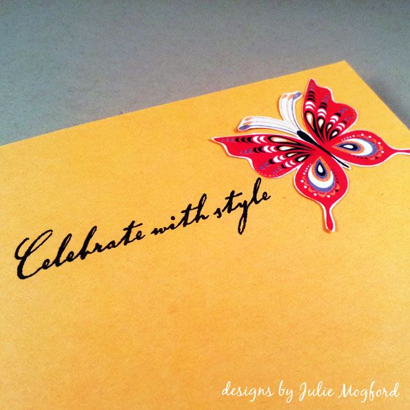
7. Cut one butterfly from extra pattern paper and glue to inside of card.


What I love about this card: The butterflies in the grid pattern on the diagonal - nice! An ombre of bright warm colors definitely feels like summer.  I liked the tiny word sentiment that I was able to fit so close to the edge of the stacked cardstock - I think it sets it off nicely.

Supplies

Stamps: Around and About sentiments (Papertrey Ink), Birthday greeting on inside (Hero Arts)
Ink: Versafine Black Onyx (Tsukineko)
Paper: Cardstock (Stampin' Up!), Winsome / Ambrosia (Basic Grey)
Additional items:  Scor-Pal, Tombow tape runner, Tim Holtz scissors (Tonic)

Summer Card Camp 2 - Day 3: Cupcake Birthday Banner


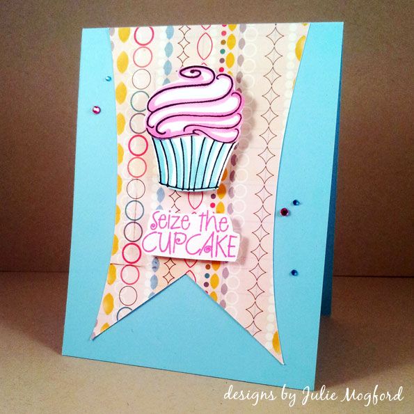
Today I have a fun birthday card based on a sketch from the Online Card Classes - Summer Card Camp 2.  It includes a rectangular banner, and I found one in my Silhouette shape library. Yea!  I wanted to use a cupcake for this card, and I found several in my stash from Hero Arts.

For your viewing pleasure:


What I love about this card: The pattern paper reminds me of paper chains my mom made last year for my sister's baby shower. The stamping is easy, and my mistakes were easily hidden. And last, but certainly not least, I love a little bling, and this time it adds to the "party" mood taking on the appearance of confetti.  Adorable!


Supplies

Stamps: Cupcake stamps and sentiment (Hero Arts), Have a delicious birthday! (Rubber Soul)
Ink: Versafine Black Onyx (Tsukineko), Distress Ink in Picked Raspberry and Tumbled Glass (Ranger)
Paper: Cardstock (Stampin' Up!), Abroad (Studio Calico)
Additional items: Aquamarker (Letraset), Banner cut (Silhouette), Scor-Pal, Tombow tape runner, Recollections foam adhesive.


Thanks for dropping by!


Julie

Wednesday, July 17, 2013

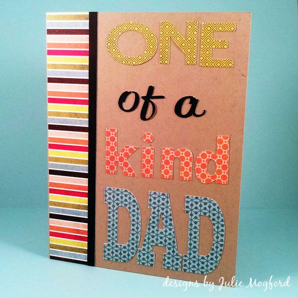
Summer Card Camp 2 - Day 2: One of a Kind Dad

Hello again!


It's time for my Online Card Classes - Summer Card Camp 2 Day 2 assignment.  One of the techniques was to stamp a multi word sentiment in several colors using a masking technique.  I couldn't find a sentiment in my stash I wanted to use so, I went with my own take on this idea. I used my Silhouette Cameo to die cut the words of my sentiment in different fonts on coordinating patterned paper. Also, this card has many elements that are not part of my typical cards.

1. It's for a man - my dad :)
2. Is actually gender neutral
3. Uses lots of patterns together
4. Has 4 different fonts

The video is kinda funny.  I have edited parts to go fast, added some music over the fastest part, got some mic help from my husband (thanks Davis!) and a few flubs from getting tongue tied, but it's not too shabby!  And, it's under 10 minutes - woo hoo! :)  Enjoy!


Font List - These are sets that were either on my computer, free for personal use, or I purchased.  You can use any fonts you would like.  Also note, that some of the fonts were stretched or resized to get the shapes I wanted for my card.  That's one of the many reasons I love my Silhouette Cameo.

ONE - Edmondsans Bold
of a - Reklame Script Regular
kind - TW Cen MT Condensed Extra Bold
DAD - Nexa Slab Black


What I love about this card: It is bold and fun and it is easily modified with any sentiment you want, lady or gent.  You could also use several different sets of letter stickers to create a similar look.  The possibilities are endless!  I gotta remember to do this one again!  Makes me happy :)


Supplies

Paper: Crumb Cake Cardstock (Stampin' Up!), Off Beat and Urban Paperie (Basic Grey)
Additional items: Font die cuts (Silhouette), Scor-Pal, Tombow tape runner and Mono Multi Liquid Adhesive, Fiskars cutter


Ok, so what are you waiting for?  Time to get creative!!!
See ya next time,

Julie

Monday, July 15, 2013

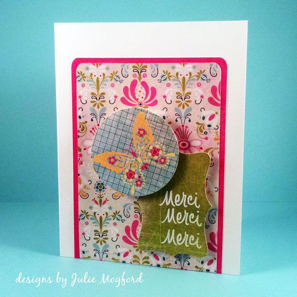
Summer Card Camp 2 - Day 1: Merci

Hello all!

Many of you know that I'm a teacher, and we teachers really look forward to our summers!  Well, this year, my summer has only just begun, but what better way to get it started than with a card class. I spent the weekend catching up, but I am nearly back on track.  I will be posting several times over the next few days - I have so much to share :)


In the Online Card Classes - Summer Card Camp 2, Kristina Werner and Jennifer McGuire (and friends) prepare various color combos, sketches and techniques to share and we get to jump in and share our craftiness.

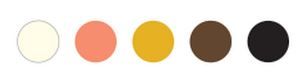
Our color combo this week:


I made a video of my session.  Take a look:


It was fun to play with this color combo and the sketch.  I tend to hoard all of my pretty papers, especially my Basic Grey papers, but I'm letting loose and trying to use all the pretty things.  And, once I use those up, I'll buy MORE pretty things. LOL.


I'm a little out of practice, but not too bad.  :)


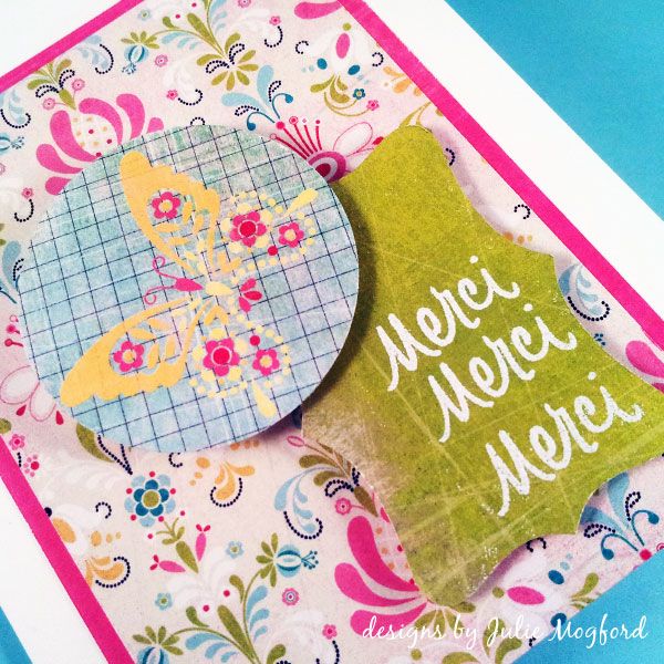
One last close up...


Supplies

Stamps: M is for - Merci (Hero Arts)
Ink: Versamark (Tsukineko)
Paper: Whisper White Cardstock (Stampin' Up!), Urban Prairie (Basic Grey)
Additional items: 2" punch (Marvy), Whisper White Embossing Powder (SU!), Banner cut (Silhouette), Scor-Pal, Tombow tape runner, Recollections foam adhesive.


Thanks for dropping by!


Julie

Sunday, March 31, 2013

More Pattern Paper

Hi everyone!

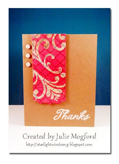
Today I am sharing my creation for Day 2 of Online Card Classes: Pattern Play.


I decided to do the ink resist technique on pattern paper.  This is another technique I like to do, but don't remember to do it that often.  I had one of those moments where I wasn't sure what I wanted to use, but started using things that were already on my desk.  {Thanks Shay!}
 
 
I started with the "oh so cute" pattern paper from Studio Calico and die cut it with a die from the Half and Half collection from Papertrey Ink.  When deciding on a stamp to use, I couldn't "resist" picking one of the cute flourishes from Flourish Fun 1 that I designed for Paper Wings Productions. I inked it with VersaMark and stamped it repeatedly over the strip of paper and embossed it with clear embossing powder.  Using an ink blending tool I added Worn Lipstick ink from Ranger/Tim Holtz until the background was sufficiently colored and revealing the embossed image.


I needed just a few more details, so I stamped a Thanks sentiment and embossed it in white EP and I had these left over punctuation marks from my Thickers and decided to use them as an embellishment instead of gems.  Definitely a different look, but I like it.


After this long absence, I think I'm finding my crafting voice again and it is such a good feeling.

Supplies
Stamps: Flourish Fun 1 by Paper Wings Productions, Thanks from Hero Arts
Ink: Versamark Ink by Tsukineko, Worn Lipstick Distress Ink by Tim Holtz / Ranger
Paper: Studio Calico "Take Note"
Other: Half and Half die collection from Papertrey Ink, Stampin' Up! embossing powder in Whisper White and Crystal Clear, Thickers by American Crafts from my stash


Thanks for stopping by!

Julie