Winnie & Walter present The Daily Grind Collection, Vol. 1
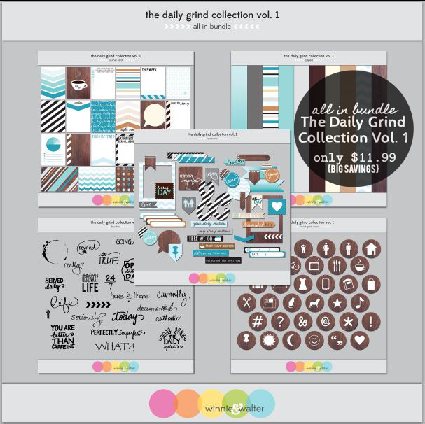
The Collection consists of Journal Cards, Wood Grain circle icons, Elements, Brushes, and Papers created to be used both digitally or as printed elements!


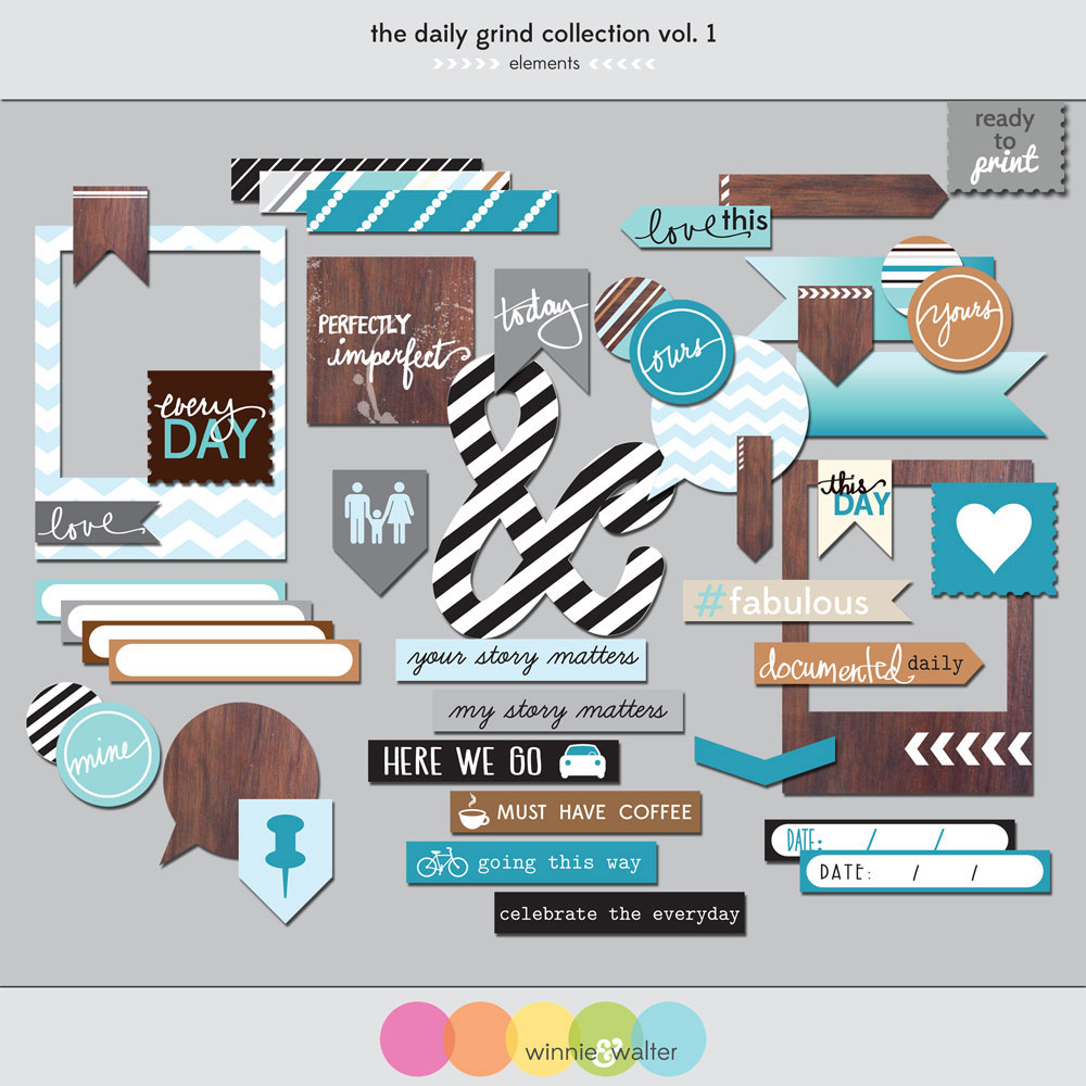
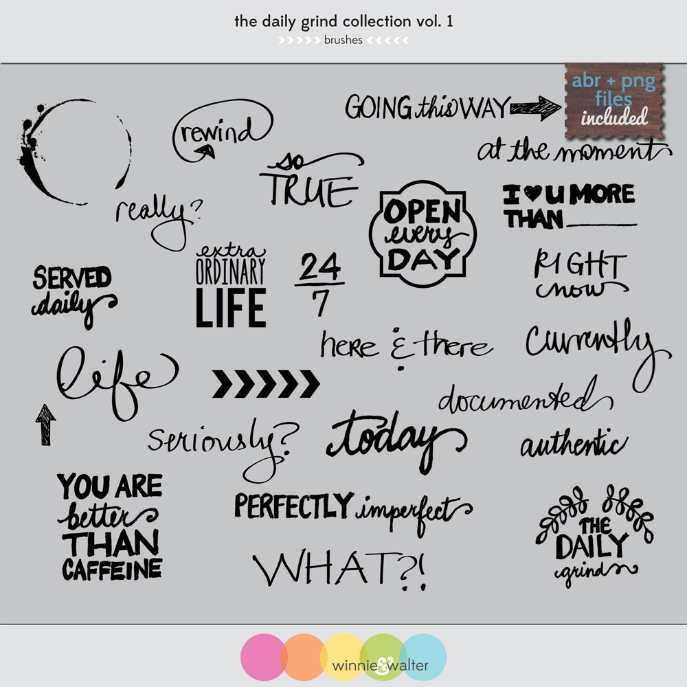

I think what I like most about this collection is the color palette and its versatility. I can use the elements easily with other things that are already in my stash - and you know I've got quite a lot in my stash. And, if that wasn't enough, you can get all of these at a reduced price by buying the "All In" Bundle!
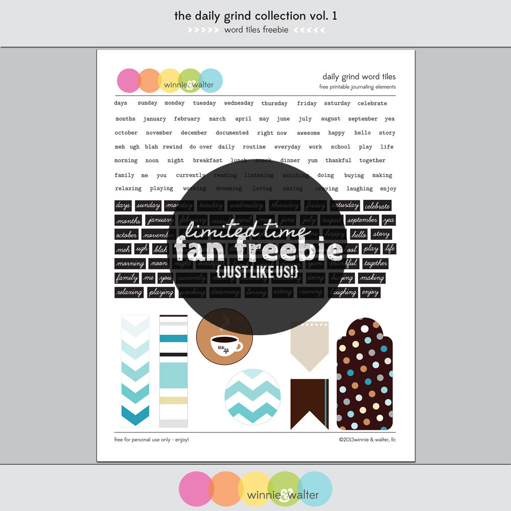
And - if you like us on Facebook, then you can get this fun, coordinating Word Tiles Freebie ...
and if you didn't pick up our last freebie, Live Laugh Love, you will find it in the Fan Freebie area of our Facebook page too! Double Freebie Goodness!!!!

You can find my samples projects for Live Laugh Love here and here.
Shay has some wonderful creations on the Winnie & Walter blog using The Daily Grind Collection, Vol. 1
It was so fun to actually get a chance to make some projects with this collection after working on the designs. Here are a few things that I made using the printable PDFs.

I was really wanting to use the chevron Polaroid element and the love tab in an unexpected way.

I was digging in my stash and found this package from K&Company of fabric flowers and buttons and thought it would be cute on a card as the focal image. I used foam tape to put the Polaroid frame on the card and then added each layer of the flowers and topped it off with a bejeweled button. So pretty! I thought that the love tab would be cute as part of the full sentiment so I added the "you" with these yellow thickers! Fun Fun FUN! This card has dimension without being too bulky.

On this card I wanted to use several of the patterns altogether plus another text strip for the sentiment. I have seen Kristina Werner do this technique several times and I really like it, but I haven't tried it in a long time. I cut strips in different widths from the patterns included with the journal cards and glued them down side by side on a strip of cardstock and then trimmed to clean up the edges.

I love the #fabulous sentiment and thought using u and r would be a perfect finish in the bold white Thickers on the chocolate chip cardstock. I am a little late to the sequin trend, but better late than never. Shay gifted me several colors of sequins and this felt like a great place to add a little sequin sparkle.
I've been wanting to try my hand at Project Life with digital elements, so I used the various papers, elements, journal cards and brushes to create these layouts. I used the templates (now from the Digital Project Life store) made by Becky Higgins that I first in the Jessica Sprague shop.

Journaling: features fonts Zephyr, Statuesque and Notebook by Karla Dudley - love these!
Top row: Grey cardstock, Large chevron circle from the Facebook Freebie (see above), circle elements resized, "currently" and arrow brush. Element strips and postage heart.
Middle row: Kraft cardstock, coffee ring and caffeine sentiment brushes.
Bottom row: More kraft, wood grain icon coffee, striped ampersand.

Journaling: More Karla Dudley and Segoe print.
Top row: I typed the date in between the stripes of the 6x4 journal card. Love how this turned out. Days of the week from the Facebook Freebie, date strip from the elements and "seriously?" brush in white with a shadow.
Middle row: Graph paper, currently and teal daily text journal card. Extra ordinary life brush in teal, plus various wood grain icon circles to match journaling.
Bottom row: I {heart} u more than brush in white with text added. Photo collage created with PicMonkey - so easy. The celebrate the everyday sentiment is a single strip, but I cut it apart in photoshop using the rectangle select tool to fit it in the space.
I was cracking myself up on some of these - my faves are the " 'sup" speech bubble for Walter and the Starbucks journaling for Davis. Makes me happy!!! :)
Be sure to check out the Winnie & Walter Blog for more details about The Daily Grind Collection, Vol. 1. If you like to get the scoop on deals and upcoming products, you can sign up for the newsletter right on our blog. Want to get this kit now? Visit us at www.winniewalter.com !
Here are a few other places you can find us: Flickr, Twitter, Instagram, and Pinterest! I think Winnie and Walter are really enjoying all of the attention they are getting lately!
GIVEAWAY
One more thing going on at the blog right now - sign up to win the whole collection! Don't you just love free stuff???
Thanks for stopping by! Happy creating!
Julie
All projects feature The Daily Grind Collection, Vol. 1 by Winnie & Walter.
love you card:
flower elements and button by K&Company, Thickers by American Crafts, pink ribbon by Stampin' Up!, Neenah Solar White cardstock, foam tape, 3 in 1 glue by Beacon, Mono Multi Liquid Glue by Tombow.
u r #fabulous:
chocolate chip cardstock by Stampin' Up!, Thickers by American Crafts, sequins, foam tape, Mono Multi Liquid Glue by Tombow.
project life - nov 4-10 and nov 11- 17 layouts: Karla Dudley fonts, Pic Monkey, Photoshop Elements, Becky Higgins digital templates