Tonight, while I root on the Spurs (GoSpursGo!!) I am posting two 12x12 layouts I created for my 2013 album. After getting some advice from my friend Shay, and looking at what several designers have created online, I decided to keep one album that contains my Project Life pages as well as my One Little Word pages. These layouts are the "title" layout to each of these projects.
Let's start with Project Life!
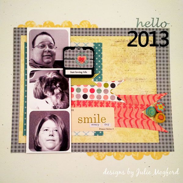
My layout was inspired by this one I found on Pinterest from the Crate Paper blog. I wanted two show a pic of my husband, my dog and me in a filmstrip style layout and then add color with all of the banner strips and embellishments.
Silhouette - I love you!
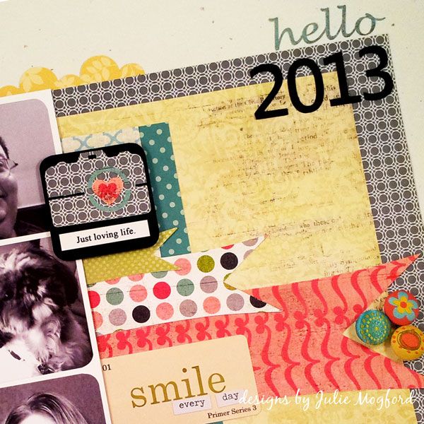
I used the same banner strip over and over again, just resized, in several different Basic Grey designs. I also wanted a camera image and cut this one from a camera image downloaded from the Silhouette store. I made the yellow scalloped border design using the Silhouette software and cut the "hello 2013" as well. My little Walter looks cute peaking in there on the left!
Paper: Basic Grey Olivia (Amelia side B, McKinley, Brianna A & B), Pink Paislee Vintage Moon (Full Moon), Studio Calico (Take Note), Pebbles (Seen &Noted), Stampin' Up! (Black cardstock, Confetti White cardstock, grey geometric design and yellow floral).
Embellishments: Jenni Bowlin (Playful Hodge Podge Stickers), Memory Box (green and lavender polka), Tim Holtz (Chit Chat Verbiages Charla), Creative Imaginations "Narratives", and The Paper Studio designer brads.
Now let's look at OLW
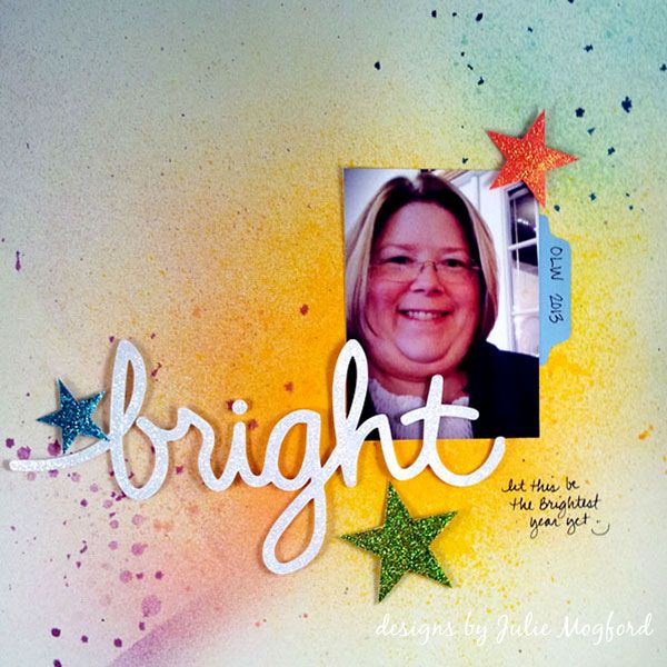
I loved this page by Jen Jockisch and used it as a partial inspiration for my layout, not because of the title, but just how it had a single photo and a cursive title. My word of the year is BRIGHT and I created a brush in Illustrator of my handwriting to use on these cards I created from the January assignment. I used the same image in my Silhouette software to cut out the same handwritten BRIGHT for the title.
Silhouette - I really really love you!!
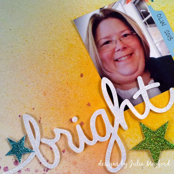
I wanted a very simple background so I misted several colors of spray in bright colors to give a nice backdrop to the white title. I also cut out the three stars with the Silhouette and coated all of my cut outs in stickles *sigh*.
Supplies:
Ink: Dylusions Sprays (Vibrant Turquoise, Pure Sunshine), Tattered Angels (Vintage Pink, Cranberry Zing, Trunk Bay, Sun Sisters).
Paper: Colored cardstock from stash and background was sprayed on Confetti White SU!
Embellishments: Stickles (Fruit Punch, Aqua, Lime Green and Diamond).
I've been away from scrapbooking for a very long time, and things are very different now. I always felt free to create what I wanted and was using all the right tools to achieve the look I wanted, but now, it's a whole new world, and I am loving it!
Have a great weekend and Happy Mother's Day!
Julie


Beautiful pages, Julie. I love the 3 picture/filmstrip in the first page, along with the bright colors on the second page. You are so right, It has been about 5 years since I have done any scrapbook layouts, and things HAVE really changed. Keep up the good work, and have fun!
ReplyDeleteMindy
Thanks Mindy! I'm still laughing at the filmstrip one because it says "smile" and I'm not smiling - and neither is Davis really....just the dog LOL
ReplyDelete