Pages

Thursday, May 16, 2013

Project Life - Week 1 & 2

Happy Thursday Everybody!

Today, I am sharing my first two weeks of Project Life pages.  These have been done for awhile, but I am just now getting them up on the blog.  I really like using the pocket page style of scrapbooking.  Sometimes a 12x12 page can feel a little intimidating or for me, I can never decide on a layout or sizes for my photos. I chose some pocket pages designed for Project Life, and some from American Crafts.  I think what I like about the pockets are that it is like making several mini pages, and sometimes that is really fun, and also I like that this format feels like "anything goes".  My approach to traditional scrapbooking was always a strange "perfection" issue - the page needed to be PERFECT and if it wasn't I was disappointed.  Now, the pictures and memories come first, and the pressure is off for how perfect the page needs to be.  I also like that as your eye travels around the page, there are so many different moments and you can tell so many more stories in the same amount of space.  Am I going on and on?  Well, maybe a little, but I really like it - what can I say?

As for using the Project Life kits - I actually haven't bought any, although they are so great!  I just chose to use this opportunity to dive into all of the fabulous scrapbooking paper I have been hoarding all of this time.  FUN!!!! One more thing - I am deciding as I go through the year if the week should be a 1 page or 2 page layout.  Right now, these are just 1 week for a 12x12. This was plenty for me.

OK - here we go - take a look at Week 1
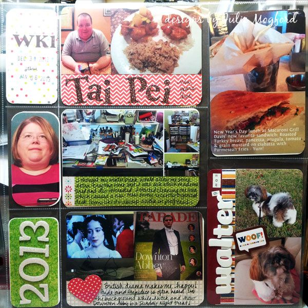
 
 
Here are some of my favorites from this week:
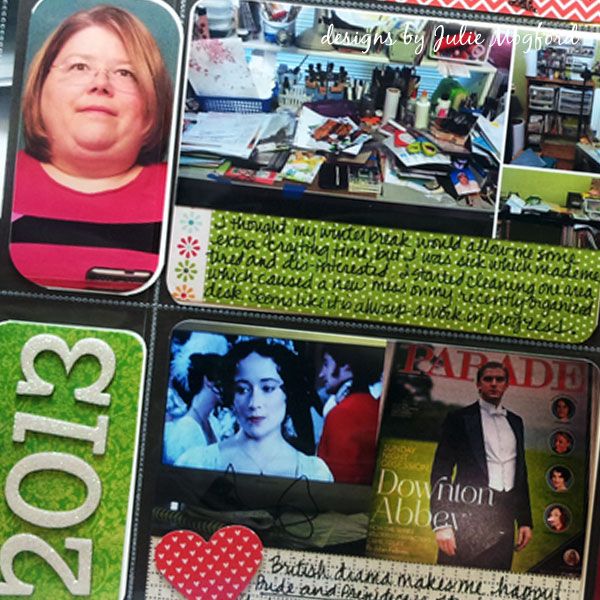
 
 
2013 in White Glitter Thickers
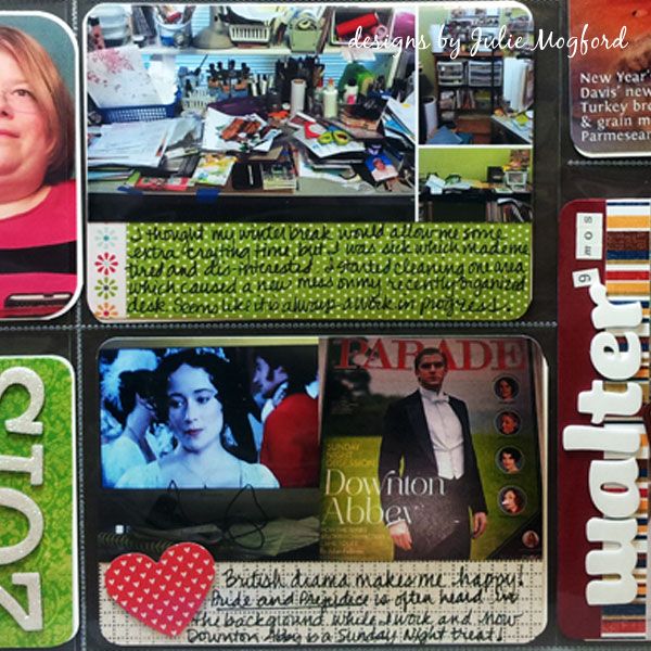


Pictures of my craft space and my British Entertainment!
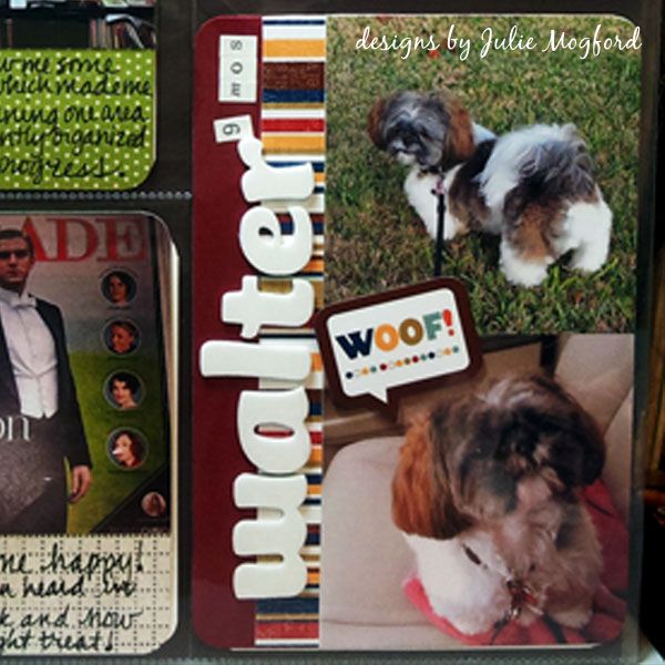


My little Walter - just 9 months old in this pic.  I love the Echo Park paper here!
 
 
Now, for Week 2
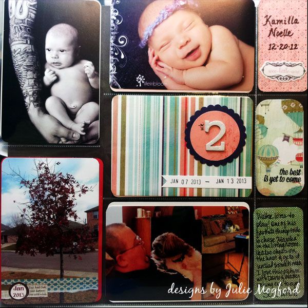


Here are some favorite moments:
 
 
Digital journaling on top of Splendid Fiins "Brilliant Border Bits".  Fun!
Plus, my two guys :) [you can find other designs for Splendid Fiins here]
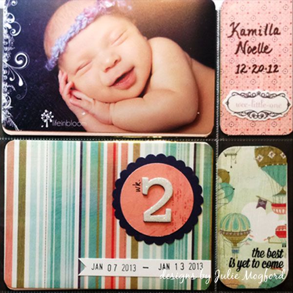


Adding a digital brush to my neice's photo - so pretty.  Finding a stash of baby embellishments (Wee Little One - BasicGrey).  I wrote Kamilla's name with a calligraphy pen (PITT). More BG papers for the wk2 pocket and the hot air balloons, and "the best is yet to come" sentiment fits so nicely (from Studio Calico). I love how this all works together.


If you aren't into scrapbooking in the traditional sense of the word, you may really like this method for a fast way to get 4x6 photos into an album and off of your camera where everyone can enjoy them.  Plus, I like remembering the everyday moments too.  Great way to tell your story! Fun Fun Fun! 

Thanks for stopping by!

Julie

Wk 1 Layout:
Paper: Echo Park and Pebbles (Seen and Noted)
Stickers: American Crafts Thickers, BasicGrey sticker letters, glitter sticker letters

Wk 2 Layout:
Paper: BasicGrey "What's Up?
Stickers: American Crafts Thickers
Digital: Splendid Fiins Brilliant Border Bits, Rhonna Farrer swirl brushes
Stamp: Studio Calico
Ink: Memories Ink (Stewart Superior)

Saturday, May 11, 2013

Album Cover Pages

Hello everyone,

Tonight, while I root on the Spurs (GoSpursGo!!) I am posting two 12x12 layouts I created for my 2013 album.  After getting some advice from my friend Shay, and looking at what several designers have created online, I decided to keep one album that contains my Project Life pages as well as my One Little Word pages.  These layouts are the "title" layout to each of these projects. 


Let's start with Project Life!


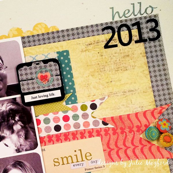
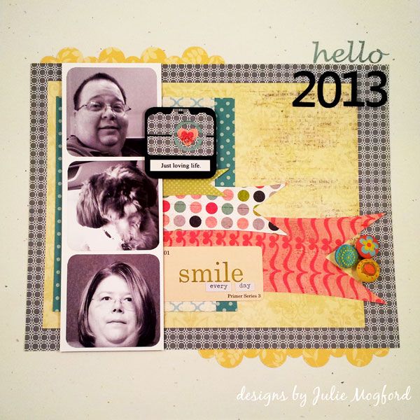
My layout was inspired by this one I found on Pinterest from the Crate Paper blog. I wanted two show a pic of my husband, my dog and me in a filmstrip style layout and then add color with all of the banner strips and embellishments.


Silhouette - I love you!
I used the same banner strip over and over again, just resized, in several different Basic Grey designs.  I also wanted a camera image and cut this one from a camera image downloaded from the Silhouette store.  I made the yellow scalloped border design using the Silhouette software and cut the "hello 2013" as well. My little Walter looks cute peaking in there on the left! 

Supply List:
Paper: Basic Grey Olivia (Amelia side B, McKinley, Brianna A & B), Pink Paislee Vintage Moon (Full Moon), Studio Calico (Take Note), Pebbles (Seen &Noted), Stampin' Up! (Black cardstock, Confetti White cardstock, grey geometric design and yellow floral).
Embellishments: Jenni Bowlin (Playful Hodge Podge Stickers), Memory Box (green and lavender polka), Tim Holtz (Chit Chat Verbiages Charla), Creative Imaginations "Narratives", and The Paper Studio designer brads.


Now let's look at OLW


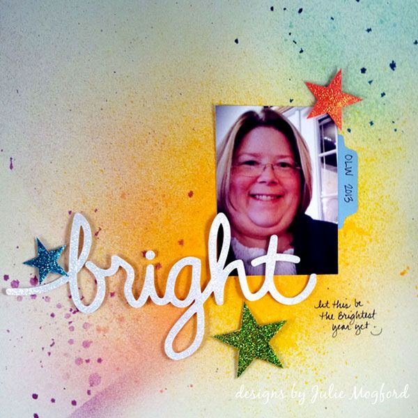
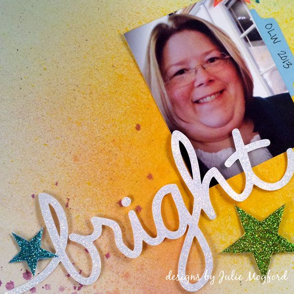
I loved this page by Jen Jockisch and used it as a partial inspiration for my layout, not because of the title, but just how it had a single photo and a cursive title.  My word of the year is BRIGHT and I created a brush in Illustrator of my handwriting to use on these cards I created from the January assignment. I used the same image in my Silhouette software to cut out the same handwritten BRIGHT for the title.


Silhouette - I really really love you!!
 
I wanted a very simple background so I misted several colors of spray in bright colors to give a nice backdrop to the white title.  I also cut out the three stars with the Silhouette and coated all of my cut outs in stickles *sigh*.
 
Supplies:
Ink: Dylusions Sprays (Vibrant Turquoise, Pure Sunshine), Tattered Angels (Vintage Pink, Cranberry Zing, Trunk Bay, Sun Sisters).
Paper: Colored cardstock from stash and background was sprayed on Confetti White SU!
Embellishments: Stickles (Fruit Punch, Aqua, Lime Green and Diamond).
 
I've been away from scrapbooking for a very long time, and things are very different now.  I always felt free to create what I wanted and was using all the right tools to achieve the look I wanted, but now, it's a whole new world, and I am loving it!


Have a great weekend and Happy Mother's Day!
 
Julie

Monday, May 6, 2013

Blog updates!!!

Hello all,

I've been burning the candle at both ends, and one of the things I have been up to is planning out some new blog design ideas.  Tonight, I just added my new background element.  I was inspired by other papers I had seen that had a similar design, and decided to create my own.  I think it turned out pretty good.  I will be playing with the blog header next and hopefully will have it up in the next few days. 

I might get a little more done in the next few minutes while we watch the Spurs.  Go Spurs Go!!!

Keep checking back for more updates - and thanks for stopping by!

Julie

Edited to add:  I was able to get the blog header done too!  woo hoo!

Sunday, March 31, 2013

Moxie Fab - Chevron Challenge

Hello again!

Don't you just love a long weekend?  I know I do!  I was so glad to have the time to work on some challenges over at Moxie Fab World.  This is the first one I attempted - The Chevron Challenge.  I don't usually have time to work on card challenges, but I'm going to be making more time in the future. This was fun, and it makes me stretch my creativity.

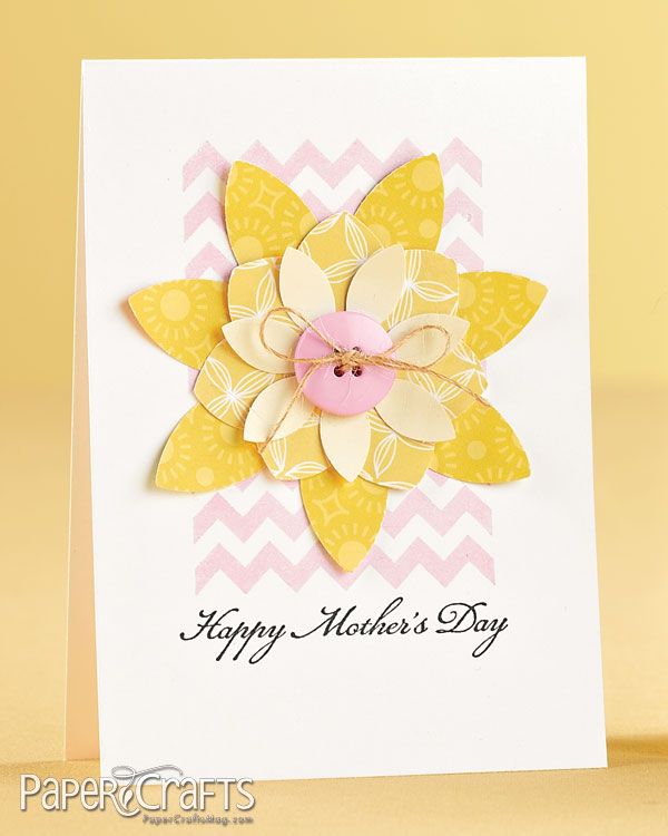
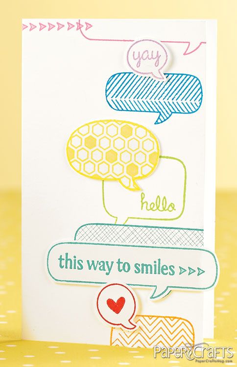
Here is the sample to get us started:


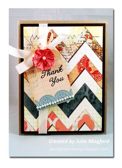
This is my version!


I'm still working on trying to use products that are already on my desk, and the only thing that was out of reach was the ribbon, but that's only because I keep it on a shelf next to my work space :)

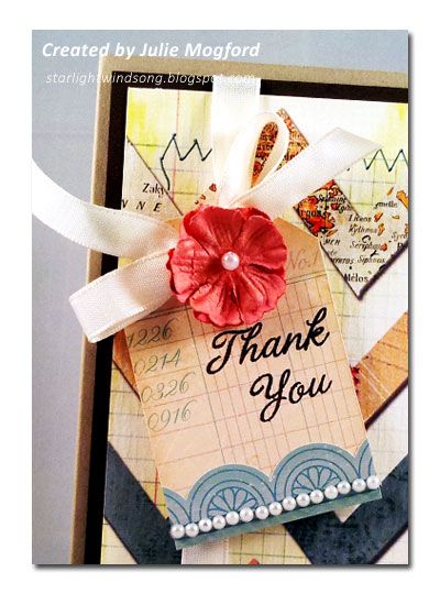
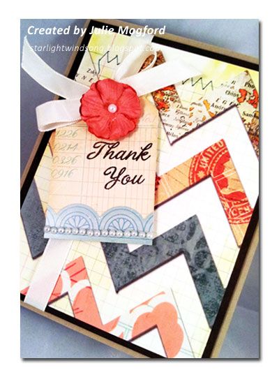
The chevron pattern was a pretty one I had been hoarding, and now was as good of a time as any to cut a piece and use it.  I also found a Crate Paper tag that was in the same muted tones as the chevrons and I thought it would be a good fit.  I used another Thank You stamp from Hero Arts.  I cut it in half and stacked the sentiment to fit the tag a little better.

This is when I got stuck - I just didn't know where to go from here and it was a bit "flat" and needed some items to set the paper off from the card base (which was going to be white, but I switched to kraft) and be flattering with the colors in the pattern paper.


I found that I also had a sticker border sheet that was the same line as the tag I had cut, and I added this detail to the bottom, bringing out the aqua lettering.  To set off the pattern paper from the base, I added a chocolate brown cardstock from my stash.  I added the vanilla ribbon to this layer and added the tag to the ribbon.  I heard this tip from Julie Ebersole I think - instead of threading the ribbon through the tag, I snipped the tag at the top through to the hole and then attached it to the ribbon. I love how this works and I don't have to fight with the tag when tying the ribbon.  The slit is hidden under the ribbon and I used foam tape to lift it off the card and keep it in place. For some last details, I found some tiny pearls to add to the sticker border on the tag, and a Prima flower in a shade that perfectly matched the pink coral in the chevron.


Tips to remember:
1. Step away and come back to look at the card with fresh eyes.
2. Cut a slit to slip tag over ribbon after it is tied.
3. Don't be afraid to cut a stamp to make it fit your needs.


This was my first challenge in quite awhile. I liked being able to push myself more to create an even better card.  This hoarded stash of mine is definitely coming in handy.  Check my other Moxie Fab Challenge post for the Speech Bubble Challenge here.


Thanks for stopping by!
Julie


Supplies
Stamps: Thank You, Hero Arts
Ink: Stazon Timber Brown, Tsukineko
Paper:  Wayfarer "Knockabout", Bazzill; Crumb Cake, Stampin' Up!; brown cardstock from stash.
Embellishments:  "Pretty Party" tag and border stickers, Crate Paper; pearls (stash); Flower, Prima; Vanilla Taffeta Ribbon, Stampin' Up!.
Other: foam adhesive, Stampin' Up!; Cropadile, We R Memory Keepers.

Moxie Fab - Speech Bubble challenge

Hello again!

I've got another Moxie Fab World Challenge creation to share.  This one is for the Speech Bubble challenge.  Take a look at this challenge sample.


This is my take:


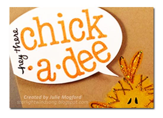
My challenge was that I needed to make a card with a speech bubble, but I had no speech bubble stamps or dies.  Never fear!  I found a really cute design set on the Silhouette store from Sarah Hurley and cut it on my Cameo. I was able to resize the bubble to fit with both the bird and the size of the card - gotta love that about the Silhouette!  For the sentiment I chose some alphabet stickers from Basic Grey and added the "hey there" with the same pen. 

 
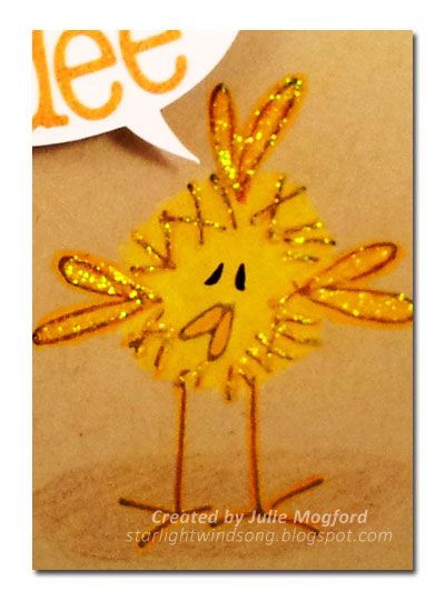
OK, let me just say that I LOVE THIS BIRD!!! I do!! I can't believe I've only used it one other time. He is just so cute! I stamped the bird with Memento ink and colored him using Prismacolor pencils.  I went back over his eyes with a Faber Castell Pitt Artist Pen.  It worked great over the top of these waxy pencils. I couldn't help myself so I added some yellow stickles to make him even more fabulous!  Too Fun!


I think he's pretty cute, and totally great for a Spring "Hello" card.  Hope you enjoyed this one as much as I did and I hope you are enjoying the Spring weather as much as I am. And, if you like challenges, check out my post of my other Moxie Fab challenge creation for Chevrons.


Thanks for stopping by!

Julie


Supplies
Stamps: Dorky Bird  O-75 by Judith
Ink: Espresso Truffle Memento, Tsukineko
Cardstock: Crumb Cake, Stampin' Up! and white cardstock from stash
Embellishments: Picadilly Alpha Stickers, Basic Grey; Silhouette speech bubble die cut, Sarah Hurley.
Other: Pitt Pen, Faber Castell; Color Pencils, Prismacolor.